The first 10 WAR (Wins Above Replacement) Trade Networks are now available for exploring! This initial group includes nine team networks and one overall graph with all teams included. Here’s a list of the 10 graphs:
Each of these and any upcoming WAR trade networks can be found on this page.
Let’s walk through how the graphs work, using the Detroit Tigers network as an example. We’ll begin with an anatomy of the graph display:
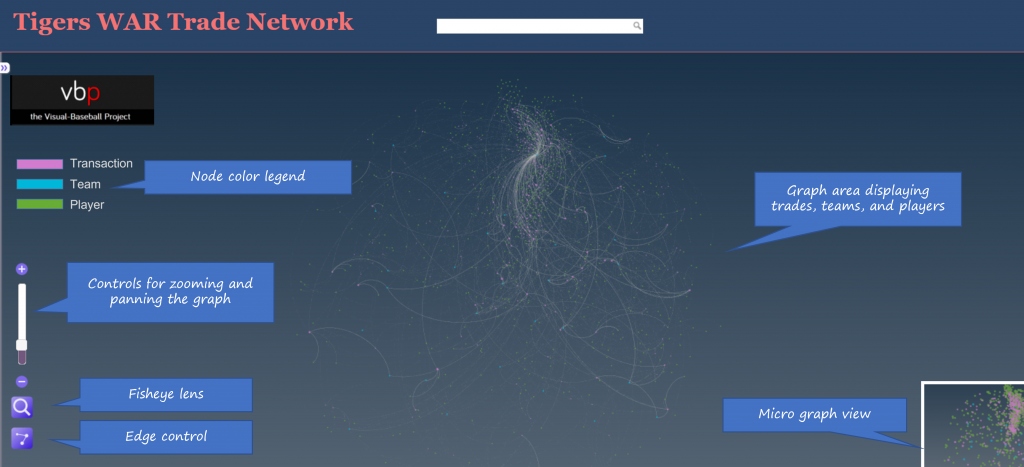
As the image shows, the primary focus will be the main graph area in the center of the window. This is where all nodes (transactions, teams, and players) will reside, connected by edges based on common relationships. Transaction nodes will vary in size based on the total value of a trade with the largest nodes indicating a trade that created significant future WAR for one or both teams. Team and player nodes are set to constant sizes so that the initial visual focus will be on the transaction nodes. The size differences become more noticeable when we zoom in to the network. More on that shortly.
Edges are also sized based on WAR value; this is where we see the value provided to a team and by specific players. Edge sizes (weights) will be more easily seen when we zoom in to the network.
On the left are some graph controls to assist in navigating the graph. We can zoom in using the slider control or the plus/minus buttons adjacent to the slider. Zooming can also be done with a mouse scroll if you prefer that option. The fisheye lens can be toggled on or off and can be used to highlight certain areas of the graph by hovering over a selected region. Finally, the edges button will enable showing or hiding edges and connected nodes. This is useful when you wish to reduce surrounding nodes and focus on specific transactions. We can also pan the graph by dragging it using a mouse – this is helpful in centering a network or viewing specific regions of the graph.
At the upper left of the window is a color legend for each node type, and hidden on the left (not shown in our image) is an information pane that will show specifics about the network. More on that in a bit.
Now let’s examine the information window – this is what makes the network truly powerful. When the network is first displayed or the browser window is refreshed the information pane displays information about the graph (open it by clicking on the arrows icon at the top left):
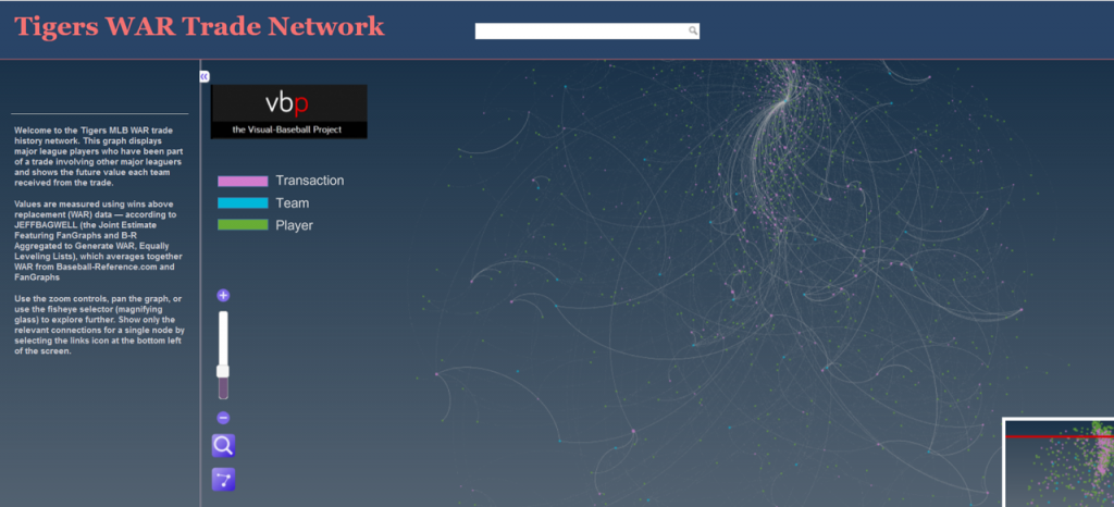
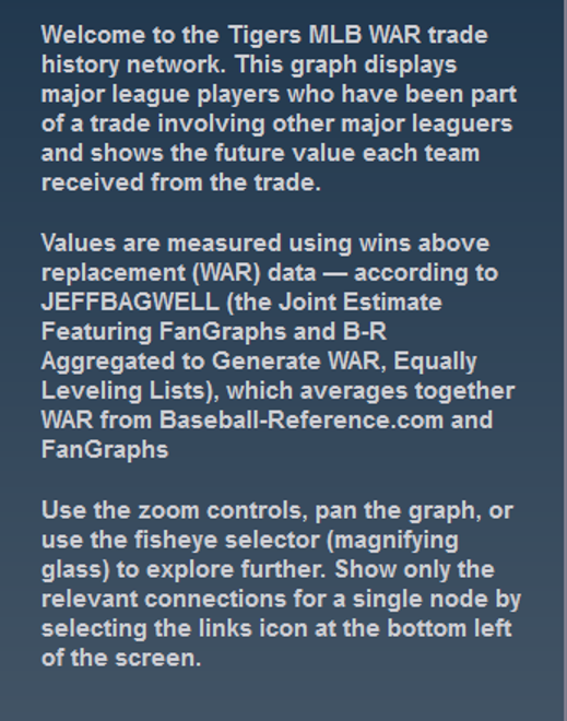
You can see the simple overview of the graph, the source data, and what it aims to accomplish. Here’s an enlarged version for easier reading:
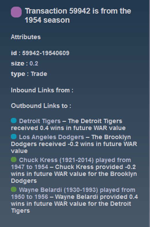
If we zoom in and select a specific transaction the pane displays the relevant details for that selection:
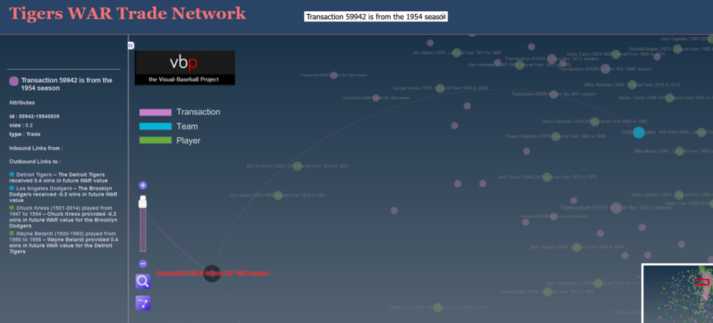
Now we have the details for the transaction – the season, teams, and players involved. Here’s the enlarged view:
You can do this for any transaction in a graph, or you could choose to select a team or player to see how they fit into the network. The possibilities are nearly endless and it’s a fun way to understand the relationships between teams, players, and trades.
We’ll do more exploring of the networks in upcoming posts; I’ll also be adding more teams until we have a complete set of trade networks. In the meantime, feel free to explore the graphs to learn more about the best (and worst) trades your favorite team has made over the last 120 years. Enjoy, and thanks for reading!

KJOzAlHZtDEwphkQ
OGRVFfmLpXxsY
14icdn