Month: July 2016

A Network Graph of MLB All-Stars

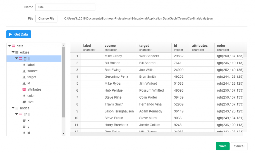
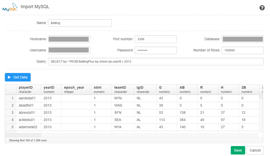
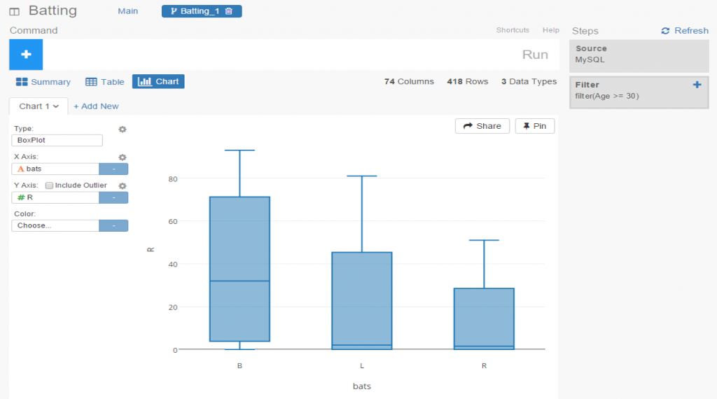
With the Major League Baseball All-Star game this week, I was suddenly possessed by an urge to create a network graph of all the players who have been selected for the game from 1933-2015. The goal, as with most of my network graph efforts, was to see where the data took me, and what stories it might tell. Along for the ride was my trusty companion Gephi, version 0.9.1 in this instance. Data for this exercise comes, as it so often does, from the Lahman baseball database, which happens to have a nice table with all the necessary all-star information.

The challenge inherent in this data, as with many temporal datasets, is to create an interesting graph that isn’t entirely driven by the time element, in this case as baseball seasons. Some otherwise excellent layout algorithms tend to turn this sort of data into long, worm-like displays that are not visually appealing. I could just as easily use a timeline if that were the goal of the visualization. So in an effort to balance aesthetics with the underlying data, I finally settled on the radial axis layout in Gephi. With this layout, we have the ability to create multiple axes radiating from the center of the graph, grouped by something meaningful. In this case, that turns out to be the modularity class, a sort of clustering mechanism that groups nodes together based on common or similar characteristics.

After some trial and error, I wound up with 13 distinct classes, a nice manageable number for this type of display. The end result can be interpreted as some sort of exotic, colorful starfish, or perhaps as a multi-colored fireworks display. In any event, I believe it tells an interesting story in a visually appealing manner, and allows for understanding the common threads within each cluster of players. Here’s the complete graph layout:

allstar_graph_base

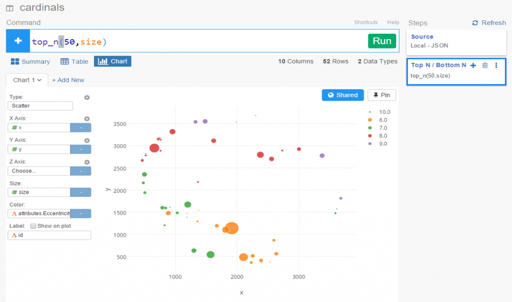
I’ll spend the rest of the post with some quick analyses of each group, and then point you to the entire graph in interactive form so you can discover your own patterns and learn more about the all-star connections of individual players. I’ll also provide a quick overview for how to read the sidebar output for the graph when you interact with the data.

Our 13 clusters (you can think of them as cohorts) tell us some interesting things about the history of all-star participants. Let’s walk through each of the 13 (numbered 0 through 12) to learn more. The clusters begin with 0 (in green) at the upper left and move counter-clockwise around the graph. Each is rank ordered from small to large radiating out from the center, so the member with the most years as an all-star will be at the tip of each group. That individual will serve as our focal point in each of the following screenshots, followed by a brief overview of other members of the cohort.

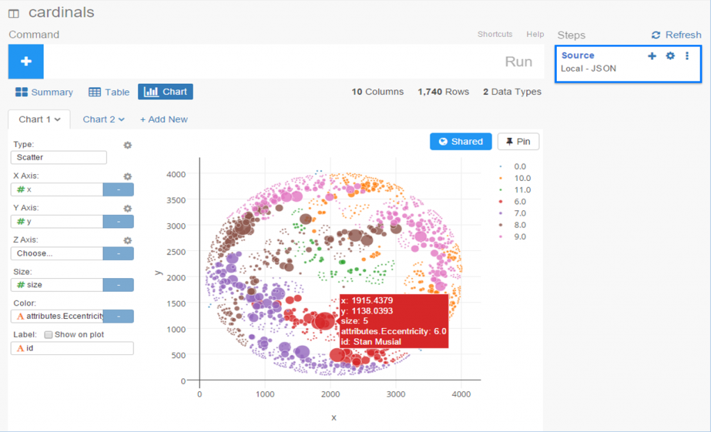
First up is our Cohort 0, headlined by Miguel Cabrera, with 10 selections through 2015. Obviously, this would appear to be a cohort of current or recent all-stars based on Cabrera’s appearance. We can easily navigate the graph to see if that’s the case. Who else is prominent in the group? Yadier Molina, Matt Holliday, and Robinson Cano, to name a few, all big name stars for most of their careers. How about at the low end of the spectrum, players with a single all-star selection? Here’s where we find the likes of Billy Butler, R.A. Dickey, and Melky Cabrera. All long-tenured, noteworthy players, but certainly not in the same category as the first group.

allstar_0

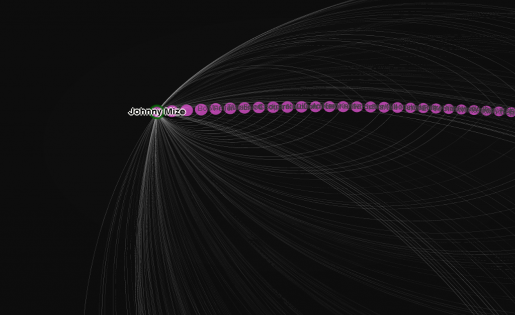
Cohort 1 takes us on some time travel, with Johnny Mize as the representative star, also with 10 all-star selections and Hall of Fame membership as well. Joining Mize in the group are Bobby Doerr, Vern Stephens, Joe Gordon, and Bob Feller, all Hall of Famers with the exception of Stephens. At the other end of the cohort, each with one appearance, are Oscar Grimes, Red Barrett, and Nick Etten, among others. Based on the career arcs of the stars in this group, we could characterize it as primarily a 1940s-based cohort, certainly with overlap into the surrounding decades.

allstar_1

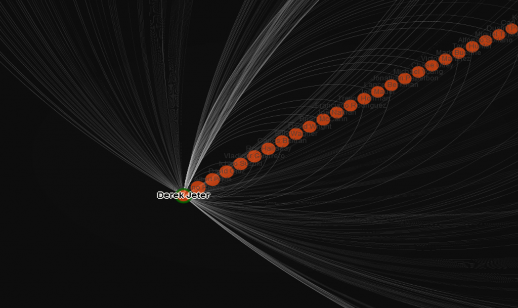
Derek Jeter is our icon for Cohort 2, so it figures to be a group that immediately precedes the Cabrera-led Cohort 0. Perhaps the focus here will be on stars from the early 2000s, at the center point of Jeter’s long career. Mariano Rivera, Albert Pujols, and David Ortiz are among the top stars here, confirming the hypothesis that this group is largely post-2000 in nature. Among the lesser knowns with a single selection each are Gil Meche, Joe Crede, and Ryan Ludwick.

allstar_2

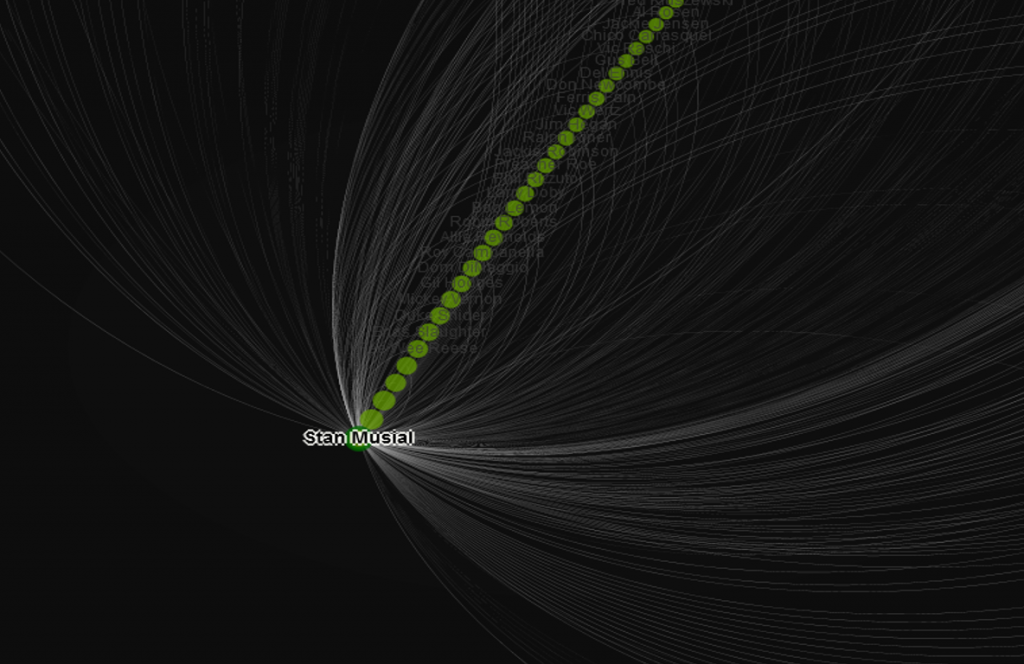
Cohort 3 is headed up by the legendary Stan Musial, whose career covered the entirety of the 40s and 50s. Given that Cohort 1 was largely concentrated on players from the 40s, we might anticipate more of a skew towards 1950 and beyond. We’ll see in a moment if that’s true. Next to Musial we have Ted Williams and Warren Spahn, two more whose careers spanned both decades, so perhaps we have players here with greater longevity compared to the Mize cohort. Let’s go a bit deeper, where we find Roy Campanella, Larry Doby, and Robin Roberts, all with career pinnacles primarily in the 50s. So while there will certainly be connections across the two groups, Cohort 3 does appear to span more of the 1950s compared to Cohort 1.

allstar_3

With Cohort 4 we see a very large group fronted by all-time hits leader Pete Rose. So we could be focused on the 1960s or 1970s here; Rod Carew, Reggie Jackson, and Mike Schmidt, Hall of Famers all, are included, so the 1970s would seem to be the dominant theme. Perhaps we shouldn’t be surprised at the size of this group, as expansion in the 1960s afforded more players the opportunity to become an all-star. A few interesting figures can be found at the single game end of the radian – Bob Horner, Kent Hrbek, and Lonnie Smith, all with at least momentary brushes with greatness, but good enough to qualify for just one all-star nod apiece.

allstar_4

Joe DiMaggio is the lead for our next group, joined by the likes of Mel Ott, Bill Dickey, and Joe Medwick. The skew is toward the late 1930s and beyond; many members of this cohort would have had limited all-star game opportunities, as the game originated only in 1933. As proof of this, we find Hall of Famers Heinie Manush, Goose Goslin, and Kiki Cuyler at the low end of the radian, each with just a single all-star credit.

allstar_5

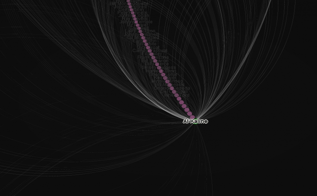
Hall of Famer Al Kaline heads up Cohort 6, so we know we’re in either the 50s or 60s, or more likely, a bit of both decades. Along with Kaline we have Mickey Mantle, Yogi Berra, and Ernie Banks, each of who had multiple appearances covering both decades. At the more modest end of the group we find Rocky Bridges, Bob Cerv, and perhaps surprisingly, the slugger Joe Adcock, each with just a single season as all-stars.

allstar_6

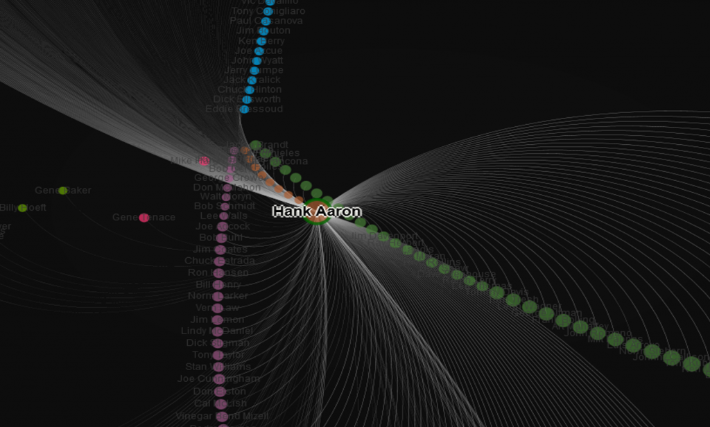
Cohort 7 is our one group that’s difficult to explain. Our graph modularity settings forced a small cohort of just nine players; Hank Aaron with 21 seasons, and eight others with a single season each. Consider this one a bit of a fluke.

allstar_7

The great Willie Mays leads the relatively small Cohort 8, joined by both Brooks and Frank Robinson, as well as Roberto Clemente. This would indicate a cohort of players who began in the 1950s and perhaps peaked in the 60s. Lower down the list this group features lesser known players like Tito Francona, Dick Howser, and Joey Jay, all one season all-stars.

allstar_8

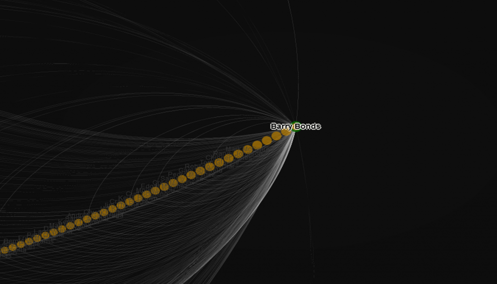
Cohort 9 is a very large group led by Barry Bonds, Ivan “Pudge” Rodriguez, and Ken Griffey. Here we have three stars with illustrious careers launched around 1990 and extending into the new millenium. At the other extreme we find one-timers such as Jay Buhner, Mark Grudzelianek, and Lance Johnson.

allstar_9

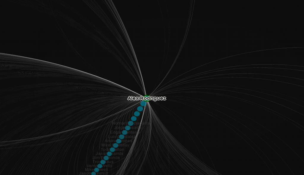
Cohort 10 is a mid-sized group headed up by Alex Rodriguez, and featuring Manny Ramirez, John Smoltz, and Scott Rolen. This would appear to be a very similar group (if a few years later) to the prior cohort, and we should expect to find a great number of crossover connections between the two, as they each cover players from similar time periods.

allstar_10

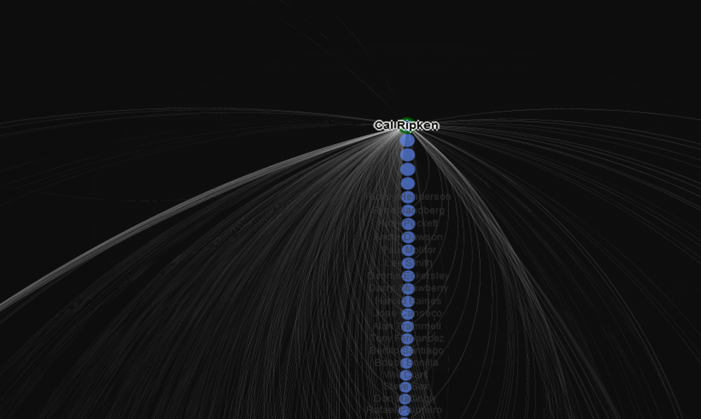
Down to the final two groups! Cohort 11 is led by Cal Ripken, Ozzie Smith, and Roger Clemens, all major impact players in both the 1980s and 90s. This is another group featuring players who were quite talented but dented the all-star ranks just a single time. Among these were outfielders Jesse Barfield and Kevin Bass, and pitcher Teddy Higuera.

allstar_11

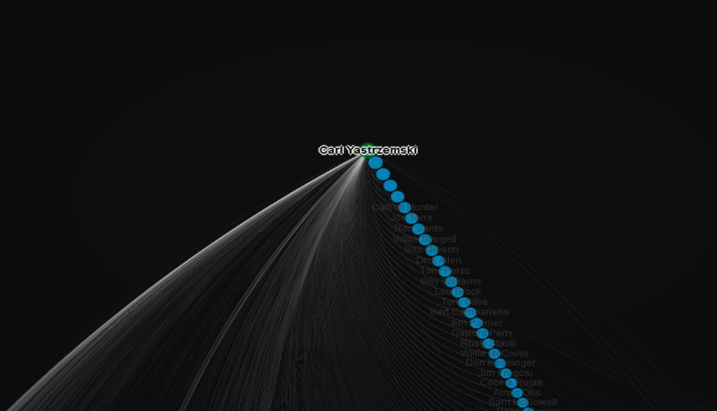
With Cohort 12, we see a large group led by 18-time all-star Carl Yastrzemski, supported by Johnny Bench, Tom Seaver, and Harmon Killebrew. These are all players who were at their productive peaks in the late 1960s through mid-1970s, an era where the National League was dominating the annual game. Chuck Hinton, Jerry Lumpe, and Joe Azcue are among those who can claim a single trip to the all-star game as a career highlight.

allstar_12

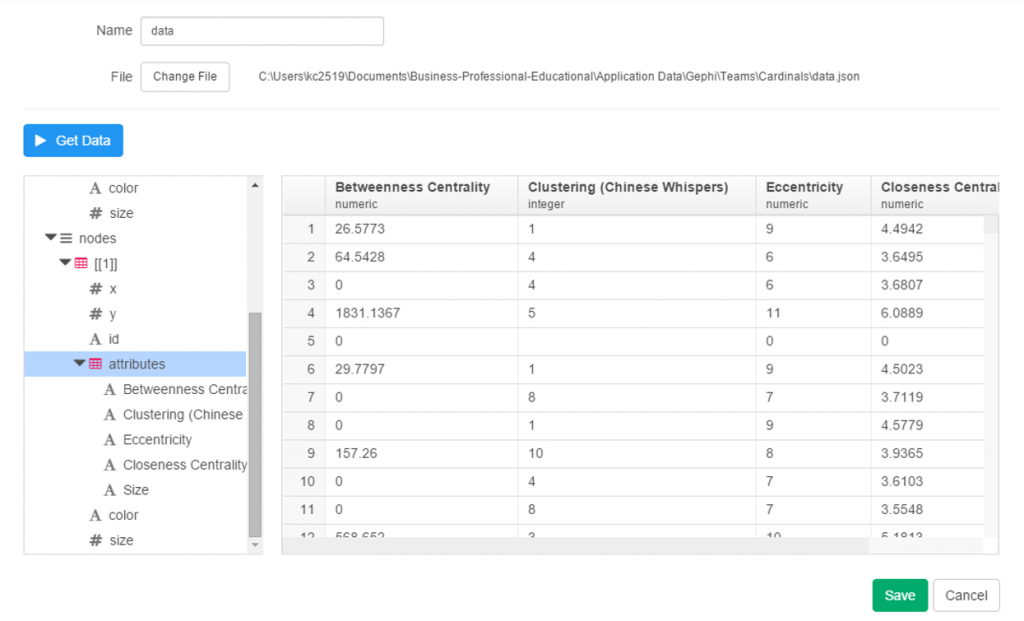
Quick note on the sidebar – you’ll see a few measures which I won’t go into too deeply here; there are 3 centrality measures (influence within the network), eccentricity (the number of steps to traverse the network, think six degrees of Kevin Bacon), and size, reflecting the number of seasons as an all-star. The key part of the sidebar lies in the listing of all connected players to the one currently selected, with numbers indicating the number of games as co-all-stars. Use these links to navigate through the network quickly. It’s fun!

So that’s it for our brief analysis. Now it’s time to explore for yourself by opening the MLB All-Star Network visualization. Be patient as the data loads; once it has cached the graph should be fairly fast at zooming, panning, and allowing you to explore to your heart’s content.

Exploratory DataViz Part 2

Having discussed some of Exploratory’s cool features in a prior post, I thought it would be fun to continue the exploration using JSON data as a starting point. I happen to have a fair amount of JSON on hand, thanks to a series of network graphs produced using Gephi and sigma.js, so why not put it to use with Exploratory and start creating a new dataviz?

If you have previously worked with JSON, you’re no doubt aware that it can be a bit fickle – miss a bracket or brace in one place and the entire file fails to load a visualization. However, knowing that my JSON has been successful in producing network graphs (see here for examples), I figured it was worth a shot with Exploratory.

To begin, start with the local import option, selecting the json option, and pointing it to your local file. Give it a name, run the process and cross your fingers! After a few seconds, I’ve got my results, and Exploratory has done a good job categorizing the data:

exploratory_2.1

Since this is network data, we have nodes and edges, as well as any additional attributes, such as color or size. Exploratory has picked up those groupings, first the edges, and now the nodes.

exploratory_2.2

Finally, the attribute values:

exploratory_2.3

Since we’re satisfied with the import, we can move on to the summary data, which in this case doesn’t make a whole lot of sense. No matter, let’s see what can be done with some charts and analysis.

exploratory_2.4

To start with, we have x and y values associated with each node, which sounds like a perfect candidate for a scatter plot. We add the x value to the x-axis (how convenient was that!), the y value to the y-axis, node size as the Size attribute, and finally the Eccentricity attribute for color. FWIW, eccentricity is not a measure of flakiness, but rather the distance between the most remote points in a graph. This is where the six degrees of separation (or Kevin Bacon, take your pick) concept comes into play; an eccentricity value of 6 equates to 6 degrees of distance. Here’s our result:

exploratory_2.5

Not bad, eh? We can also hover over each node to see who it is (after adding Id to the Label field):

exploratory_2.6

We still have a lot of activity in a limited space, so now let’s use a simple filter (see the command line at top) to grab the top 50 values, and see the results:

exploratory_2.7

Now let’s create a new branch to explore further. I would like to sort my dataset using the Betweenness Centrality attribute, but there’s one problem – it’s a character value at the moment, so it doesn’t sort numerically. No matter, we can fix that easily using the Mutate command to convert the variable type. This can be seen in the right margin, where Exploratory conveniently stores all actions. Now we can sort our values in descending order to understand who is most influential in the network (at least by this measure). FYI – Betweenness Centrality tells us which nodes others must pass through most frequently to connect elsewhere within the network. Typically, but not always, it is someone centrally located within a network; sometimes it may be a less influential character (Pedro Borbon in this case) who connects more distant groups to one another.

exploratory_2.9

So there you have it, another quick walk-through with Exploratory. Before I sign off, here’s the live scatter plot you can play with via the Exploratory server. Be sure to use the simple zoom features to traverse the chart!

[iframe src=”https://exploratory.io/chart/kc2519/1e4b6b0c24e1?cb=1467821749896&embed=true” width=”100%” height=”600″ frameborder=”0″]

Open Source Data Viz: Exploratory

It’s absolutely a great time to be alive and involved in data viz, courtesy of the wealth of exceptional open source projects. Several recent open source discoveries are currently on my radar, and worthy of further exploration. Over the next few weeks I’ll examine a few of these options, using baseball data (of course) to illustrate the possibilities within each application. Specifically, we’ll take a look at Trelliscope, bokeh, rbokeh, and Exploratory, and provide some insight and examples into how each of these projects function. This post will focus on Exploratory, an exciting new tool from Kan Nishida.

Exploratory is another R-based application that leverages a multitude of R capabilities while providing its own intuitive interface. While still in beta testing, Exploratory appears to have a very bright future as a powerful visualization tool that allows non-coders to tap into the enormous power of R. The ability to harness a considerable portion of the R language through Exploratory’s GUI is a powerful option for those (like me) with limited R experience and expertise.

Exploratory has a very clean, intuitive interface that may feel a little unusual to long-time R users accustomed to multiple panes and workspaces. Yet beneath the surface, it possesses considerable power, as we’ll see in this tutorial. To start our process, we’ll need a data frame, a familiar object for R users. Let’s begin by examining our data frame options.

First up, we can load a local source file in a variety of formats:
exploratory_local
Some of the usual suspects are here – text and Excel files, but we also have the ability to load json data as well as some of the more prominent statistical formats including SAS and SPSS data. Very cool. We’ll come back to this later.

Now let’s see the remote options:

exploratory_rscript

Great! Not only can we gain direct access to MySQL databases (a huge plus for me), Exploratory also provides access to a diverse range of option including Twitter search, MongoDB, and web scraping. We’re going to look at some specific examples later, but for now, here’s a glimpse of the MySQL data import window:

exploratory_mysql

As with the entire app, the design is clean and intuitive. In a bit, I’m going to load details into this window so we can test the MySQL functionality.

A third import option exists in the availability to access any existing R scripts you may have previously created:

exploratory_rscript

I’m not going to spend a lot of time here, due to the fact that I don’t have a lot (any?) of personal scripts. However, for seasoned R coders, this seems like a great feature.

Now let’s walk through some of Exploratory’s capabilities using a MySQL connection. The MySQL setup is really easy – just fill in your database connection parameters and you’re good to go. Here’s what it looks like for this example, with a few fields grayed out for security reasons.

MySQL connection

Once the connection is established, Exploratory will display the initial rows in the dataset. If we click the Run button, our data is pulled into a Summary view, where every variable in the data is summarized. This is a great way to see if our data looks as expected, and allows us to determine if the correct variable type (integer, date, etc.) is associated with each field.

exploratory_summary

If everything looks good, we can move on to the Table option, which will resemble the MySQL view we just saw. No surprises here:

exploratory_table

If we’re satisfied so far, then it’s time to move on to the fun aspects of Exploratory. For me, this starts with viewing data using the Charts selection. As of this writing, there are 10 chart options (two are actually mapping selections for geo data) including bars, scatter plots, box plots, heatmaps, and more. For me, this is a real strength of Exploratory; the ease with which we can see plots of our data is great! Here I’ve chosen a couple stat fields (at bats (AB) and runs (R)) to illustrate the scatter plot functionality.

exploratory_chart

The charts are clean and attractive, and provide some additional options. For scatter plots, labels can be added via a simple check box. This permits me to add hover labels, as seen below:

exploratory_chart_label

Pretty nice so far, don’t you think? But as the old commercials used to say ‘wait, there’s more’. The considerable power of R lies beneath the surface, enabling statistical testing, filtering, data manipulation, and so much more. Here’s a glimpse of just a handful of available options for working with your data:

exploratory_options

Let’s select a filter option, where we’ll reduce the data to look only at players age 30 or greater. One of the other great aspects of Exploratory is it’s exposition of R code. We can use the built in menu commands while viewing the actual R code. For experienced R users, the functions can be entered directly in a text box, and for us less experienced coders, we can learn on the fly by seeing the output.

exploratory_filter

Now we see the same scatter plot populated with players 30 and older.

Another great feature is the ability to create branches within a project. This facilitates going down multiple paths within one workspace, rather than having to retrace our steps or rerun charts each time something changes. All we need to do is click the branch button, and a new tab is created for us. Very simple and intuitive, as is virtually everything in Exploratory.

exploratory_branch

In this instance, we’ve elected to run a correlation on the chart variables in our main flow, while we create a new box plot in our branch.

exploratory_branch_chart

I’ve been very impressed thus far with Exploratory, and have barely scratched the surface. My next step will be to create some real content that can be shared in a post or via some new visualizations on the site. I love the ease of accessing my data via MySQL, and immediately having the ability to create plots, filter data, and run statistical explorations.