Month: April 2018

Pennant Race Charts Updated!

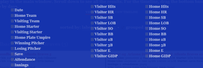
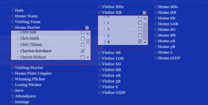
The last of my big three annual updates is now complete, as all 2016 & 2017 pennant race charts have been created, and now reside in the Visual-Baseball Project portfolio. These charts are created using NVD3, which is built on top of the powerful d3.js framework developed by Mike Bostock. These tools help make the charts highly interactive, allowing you to see where each team stands at any given point in the season, and also providing the ability to zoom in using a smaller sub-chart beneath the primary display.

The structure of the charts is based on every team’s relationship to a .500 winning percentage – a situation where a team wins exactly as many games as it loses. This structure allows for easy interpretation of the results, as we can see which teams hover near the .500 mark (i.e.- consistent mediocrity), others that rise well above this level, and also those teams that descend far below the breakeven point. Allow me to illustrate these thoughts using the 2017 American League Central division, and my hometown Detroit Tigers, who suffered through their worst season since 2003.

2017_AL_Central

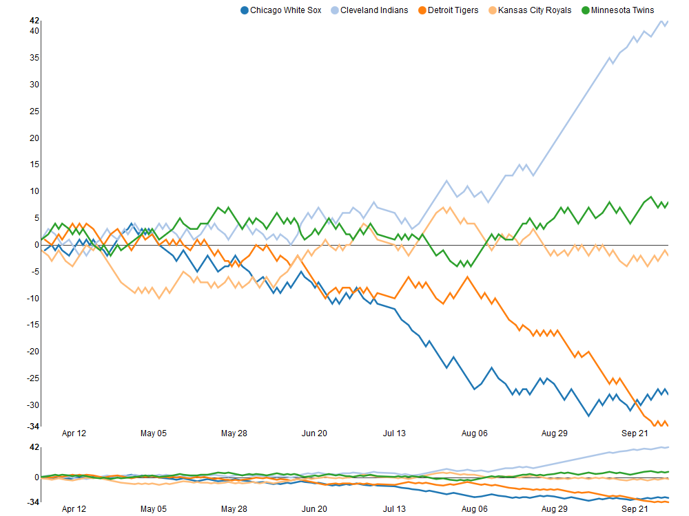
As you can see, the darker orange line representing the Tigers takes a steep dive starting in early August, culminating in a final record 34 games below the .500 percentage. Meanwhile, the rival Cleveland Indians (light blue line) present a near mirror image of the Tigers failure, with a sensational month of September that ultimately lands then 42 games over the .500 break-even level.

Similar charts have been created for the other divisions for both the 2016 & 2017 seasons. In fact, you can now view any season, league, and divisional splits dating back to the 1901 campaigns, a total of 380 pennant races to explore! Find all the pennant race charts here. Have fun exploring, and as always, thanks again for reading!

Baseball Game Summaries Updated!

Thanks to some unusually cold and rainy weather, I’ve been able to focus on updating both my source databases as well as some of the visualizations built from the data. That’s a roundabout way of saying that the baseball Game Summary exhibits have been updated for both the 2016 & 2017 seasons. They can be found in the portfolio section of the site by following this link.

As a refresher, the baseball game summaries give you a sort of visual box score for every game played in a season, featuring the line score for the game, winning and losing pitchers, attendance, and much more information pertaining to each specific game. The real power comes from the ability to filter results to find all games that match specific criteria.

game_summary_filter_1

As you can see, there are many available filter options, right down to who the home plate umpire is for every game.

Here’s a quick illustration of how the filters can be used. We’ll filter 2017 results where Clayton Kershaw was the starting pitcher at home, and gave up 4 home runs (a very rare event!). First, we select Kershaw as the Home Starter, and then we open the Visitor HR filter, and select 4 (there’s just one instance). We can then apply these filters to see at which game this unusual event took place.

Kershaw_4HR

Closing the filter window, we see the single game box score returned by our filters:

Kershaw_4HR_game

Ironically, we can see that the Dodgers not only won this game, with Kershaw as the winning pitcher, but that they too hit 4 home runs (Home HR in the box score). We can also see that the Mets struck out 13 times (Visitor SO) and the Dodgers 12 times (Home SO). Must have been a wild day at Dodger Stadium on June 19th for the 43,266 in attendance!

As you can see, a lot of information can be gleaned using just a couple of selections to filter the data. There are nearly endless possibilities for using the filters to return the information that most interests you. So have a look at the game summaries and any other items in the portfolio section. Enjoy, and thanks for reading!


Batting Explorers Updated Through 2017 Season

I’m pleased to share that the Batting Explorer visualization for the 2010s decade has now been updated with 2016 & 2017 statistics. This ongoing project captures batting statistics at the season level for every major league batter, and visualizes them in a baseball card type of format, as seen below:

Batting Explorer
Batting Explorer

A number of filters are provided to make it easy to browse across a wide range of attributes, including all of the major batting categories:

Filters
Filters

One of my favorite aspects of the Batting Explorer is the ability to link to greater detail by clicking on a specific player card, which will transport you to the Baseball-Reference page for that player:

baseball_ref_1

This project uses the Exhibit project software originally developed years ago as part of the MIT Simile project, as well as a lot of HTML & CSS for styling purposes. Give it a try, and thanks for reading.

2017 Baseball Data Updates Coming Soon!

Happy to report that the annual 2017 baseball data has been downloaded from seanlahman.com, meaning it’s time to start the annual updates. This data is a great resource for building many of my data visualizations that are featured in the portfolio section of this site. Likewise, the Retrosheet game event data has also been downloaded, meaning the onus is now on me to run the various upload and update processes for my databases.

Looking forward to putting these resources to work as I make updates to the following data visualizations (among others):

Stay tuned for updates on these and other projects, and please pay a visit to my JazzGraphs site, where the focus is on network graph analysis of jazz artists, labels, releases, and songs. Thanks for reading!