Tag: Exploratory

Updated Pennant Race Charts

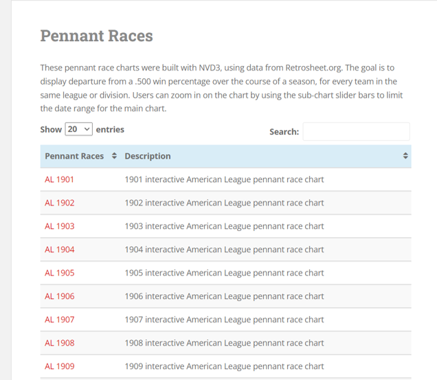
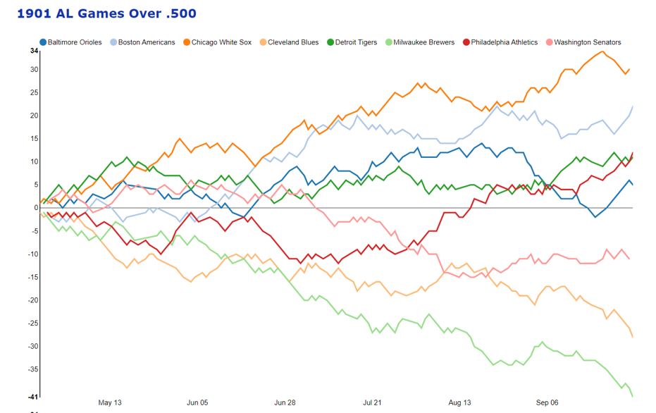
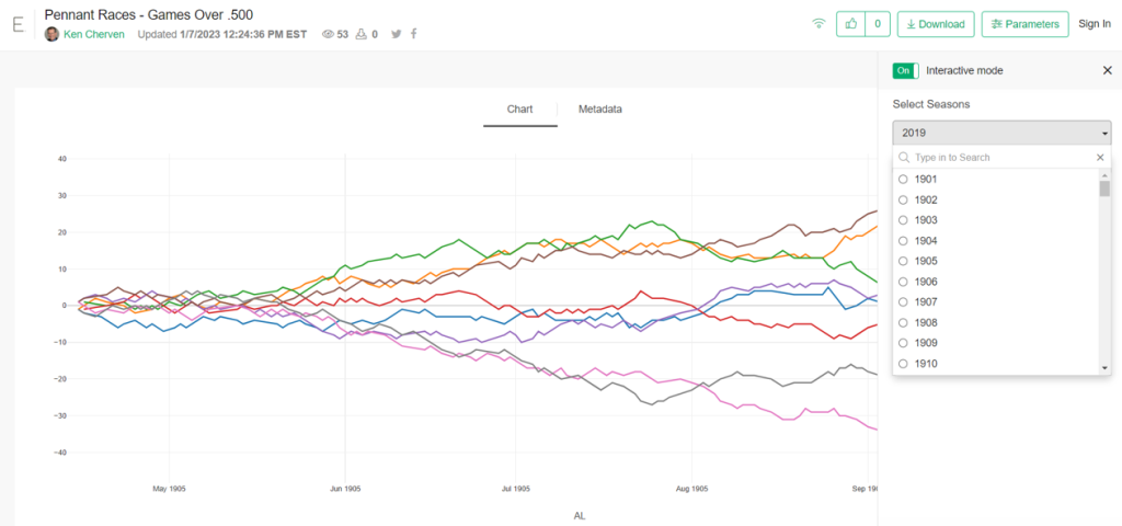
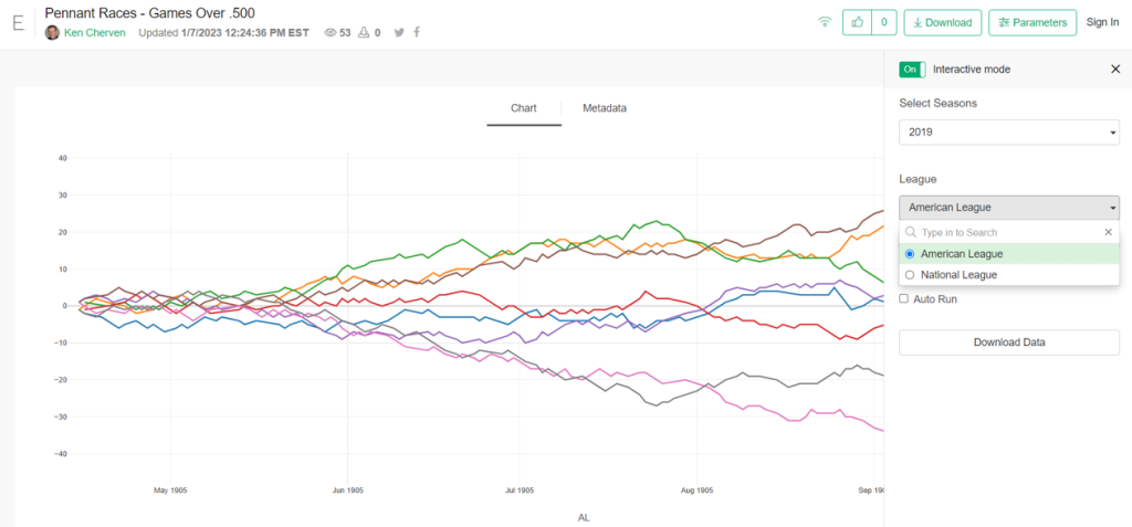
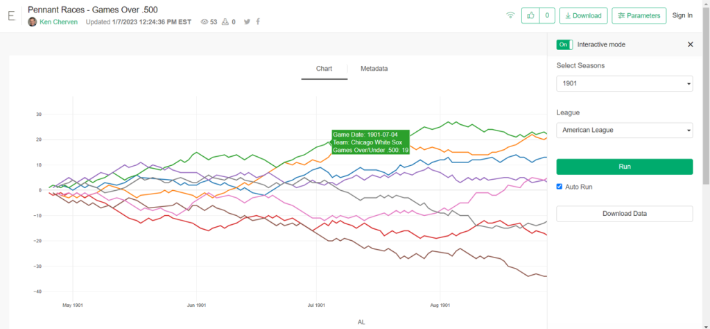
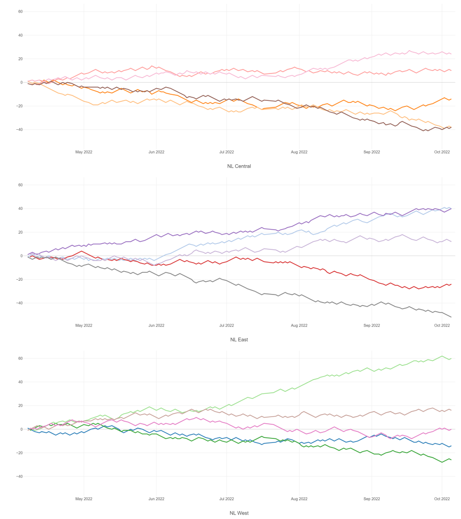
The 2020, 2021, and 2022 MLB pennant race charts using Retrosheet data have been updated on the Exploratory Server: https://exploratory.io/dashboard/kc2519/Pennant-Races-1901-current-aUu5vDT1EW. All seasons from 1901-2022 are now available using the simple parameter selection (just make sure it’s set to the interactive mode).

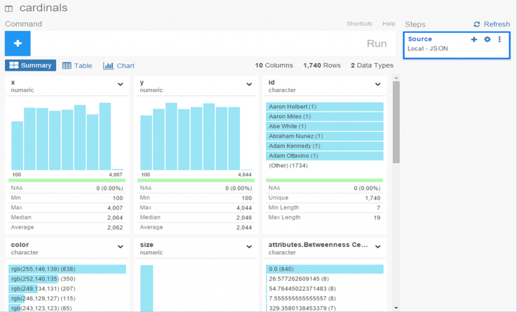
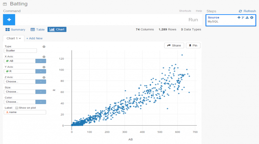
Here’s a screenshot:

Views of the 2022 National League pennant races by division

Meanwhile, I’m struggling with some JSON output for my traditional version, so no updates there yet.

Interactive Pennant Races in Exploratory

I’ve been creating MLB pennant race charts for years now, covering every season from 1901 through 2019, with 2020, 2021, and 2022 to come soon. These charts have been available on the site in single charts for each season at a league (American or National) and division level (since 1969). This has always worked reasonably well, but I have always yearned for something a bit more interactive, where users could go to one place and enter the season and league they want to view. Finally, courtesy of the Exploratory Server, such a solution is now available.

Here’s a glimpse of what I’m talking about – first, the old way of doing things, which I’ll continue to maintain. The process starts with a visit to the pennant races page on this site:

Pennant races chart selection

Selecting a specific menu option will display a single pennant race, such as the 1901 American League race shown here:

1901 American League pennant race

These charts work well, and provide some interactivity, but it is strictly one chart per link, so not very efficient.

Now, here’s the alternative option using the Exploratory server. Here I can create very similar charts but with a parameter-driven menu enabling users to select a season and a league:

Exploratory pennant race seasons filter
Exploratory pennant race league filter

Here’s a case where we select the 1901 season and the American League filters, with the following result:

1901 AL pennant race in Exploratory

The real power in this approach comes with the seasons from 1969-2019, where each league had two and then three divisions. Selecting the 2019 season and the American League filter options will now deliver all three divisional charts on a single page!

You can try this out yourself; just make sure to set the Parameters interactive mode to “On” which will activate the filters; you can control the display as well to show one or more columns. I find that a single column works best for the pennant race charts.

https://exploratory.io/viz/kc2519/Pennant-Races-Games-Over-500-Qvx9ZEF0In

I’ll be working more on this as part of the visualization options going forward; there are other cases where I can use similar functionality. Thanks for reading, and see you soon!

Exploratory DataViz Part 2

Having discussed some of Exploratory’s cool features in a prior post, I thought it would be fun to continue the exploration using JSON data as a starting point. I happen to have a fair amount of JSON on hand, thanks to a series of network graphs produced using Gephi and sigma.js, so why not put it to use with Exploratory and start creating a new dataviz?

If you have previously worked with JSON, you’re no doubt aware that it can be a bit fickle – miss a bracket or brace in one place and the entire file fails to load a visualization. However, knowing that my JSON has been successful in producing network graphs (see here for examples), I figured it was worth a shot with Exploratory.

To begin, start with the local import option, selecting the json option, and pointing it to your local file. Give it a name, run the process and cross your fingers! After a few seconds, I’ve got my results, and Exploratory has done a good job categorizing the data:

exploratory_2.1

Since this is network data, we have nodes and edges, as well as any additional attributes, such as color or size. Exploratory has picked up those groupings, first the edges, and now the nodes.

exploratory_2.2

Finally, the attribute values:

exploratory_2.3

Since we’re satisfied with the import, we can move on to the summary data, which in this case doesn’t make a whole lot of sense. No matter, let’s see what can be done with some charts and analysis.

exploratory_2.4

To start with, we have x and y values associated with each node, which sounds like a perfect candidate for a scatter plot. We add the x value to the x-axis (how convenient was that!), the y value to the y-axis, node size as the Size attribute, and finally the Eccentricity attribute for color. FWIW, eccentricity is not a measure of flakiness, but rather the distance between the most remote points in a graph. This is where the six degrees of separation (or Kevin Bacon, take your pick) concept comes into play; an eccentricity value of 6 equates to 6 degrees of distance. Here’s our result:

exploratory_2.5

Not bad, eh? We can also hover over each node to see who it is (after adding Id to the Label field):

exploratory_2.6

We still have a lot of activity in a limited space, so now let’s use a simple filter (see the command line at top) to grab the top 50 values, and see the results:

exploratory_2.7

Now let’s create a new branch to explore further. I would like to sort my dataset using the Betweenness Centrality attribute, but there’s one problem – it’s a character value at the moment, so it doesn’t sort numerically. No matter, we can fix that easily using the Mutate command to convert the variable type. This can be seen in the right margin, where Exploratory conveniently stores all actions. Now we can sort our values in descending order to understand who is most influential in the network (at least by this measure). FYI – Betweenness Centrality tells us which nodes others must pass through most frequently to connect elsewhere within the network. Typically, but not always, it is someone centrally located within a network; sometimes it may be a less influential character (Pedro Borbon in this case) who connects more distant groups to one another.

exploratory_2.9

So there you have it, another quick walk-through with Exploratory. Before I sign off, here’s the live scatter plot you can play with via the Exploratory server. Be sure to use the simple zoom features to traverse the chart!

[iframe src=”https://exploratory.io/chart/kc2519/1e4b6b0c24e1?cb=1467821749896&embed=true” width=”100%” height=”600″ frameborder=”0″]

Open Source Data Viz: Exploratory

It’s absolutely a great time to be alive and involved in data viz, courtesy of the wealth of exceptional open source projects. Several recent open source discoveries are currently on my radar, and worthy of further exploration. Over the next few weeks I’ll examine a few of these options, using baseball data (of course) to illustrate the possibilities within each application. Specifically, we’ll take a look at Trelliscope, bokeh, rbokeh, and Exploratory, and provide some insight and examples into how each of these projects function. This post will focus on Exploratory, an exciting new tool from Kan Nishida.

Exploratory is another R-based application that leverages a multitude of R capabilities while providing its own intuitive interface. While still in beta testing, Exploratory appears to have a very bright future as a powerful visualization tool that allows non-coders to tap into the enormous power of R. The ability to harness a considerable portion of the R language through Exploratory’s GUI is a powerful option for those (like me) with limited R experience and expertise.

Exploratory has a very clean, intuitive interface that may feel a little unusual to long-time R users accustomed to multiple panes and workspaces. Yet beneath the surface, it possesses considerable power, as we’ll see in this tutorial. To start our process, we’ll need a data frame, a familiar object for R users. Let’s begin by examining our data frame options.

First up, we can load a local source file in a variety of formats:
exploratory_local
Some of the usual suspects are here – text and Excel files, but we also have the ability to load json data as well as some of the more prominent statistical formats including SAS and SPSS data. Very cool. We’ll come back to this later.

Now let’s see the remote options:

exploratory_rscript

Great! Not only can we gain direct access to MySQL databases (a huge plus for me), Exploratory also provides access to a diverse range of option including Twitter search, MongoDB, and web scraping. We’re going to look at some specific examples later, but for now, here’s a glimpse of the MySQL data import window:

exploratory_mysql

As with the entire app, the design is clean and intuitive. In a bit, I’m going to load details into this window so we can test the MySQL functionality.

A third import option exists in the availability to access any existing R scripts you may have previously created:

exploratory_rscript

I’m not going to spend a lot of time here, due to the fact that I don’t have a lot (any?) of personal scripts. However, for seasoned R coders, this seems like a great feature.

Now let’s walk through some of Exploratory’s capabilities using a MySQL connection. The MySQL setup is really easy – just fill in your database connection parameters and you’re good to go. Here’s what it looks like for this example, with a few fields grayed out for security reasons.

MySQL connection

Once the connection is established, Exploratory will display the initial rows in the dataset. If we click the Run button, our data is pulled into a Summary view, where every variable in the data is summarized. This is a great way to see if our data looks as expected, and allows us to determine if the correct variable type (integer, date, etc.) is associated with each field.

exploratory_summary

If everything looks good, we can move on to the Table option, which will resemble the MySQL view we just saw. No surprises here:

exploratory_table

If we’re satisfied so far, then it’s time to move on to the fun aspects of Exploratory. For me, this starts with viewing data using the Charts selection. As of this writing, there are 10 chart options (two are actually mapping selections for geo data) including bars, scatter plots, box plots, heatmaps, and more. For me, this is a real strength of Exploratory; the ease with which we can see plots of our data is great! Here I’ve chosen a couple stat fields (at bats (AB) and runs (R)) to illustrate the scatter plot functionality.

exploratory_chart

The charts are clean and attractive, and provide some additional options. For scatter plots, labels can be added via a simple check box. This permits me to add hover labels, as seen below:

exploratory_chart_label

Pretty nice so far, don’t you think? But as the old commercials used to say ‘wait, there’s more’. The considerable power of R lies beneath the surface, enabling statistical testing, filtering, data manipulation, and so much more. Here’s a glimpse of just a handful of available options for working with your data:

exploratory_options

Let’s select a filter option, where we’ll reduce the data to look only at players age 30 or greater. One of the other great aspects of Exploratory is it’s exposition of R code. We can use the built in menu commands while viewing the actual R code. For experienced R users, the functions can be entered directly in a text box, and for us less experienced coders, we can learn on the fly by seeing the output.

exploratory_filter

Now we see the same scatter plot populated with players 30 and older.

Another great feature is the ability to create branches within a project. This facilitates going down multiple paths within one workspace, rather than having to retrace our steps or rerun charts each time something changes. All we need to do is click the branch button, and a new tab is created for us. Very simple and intuitive, as is virtually everything in Exploratory.

exploratory_branch

In this instance, we’ve elected to run a correlation on the chart variables in our main flow, while we create a new box plot in our branch.

exploratory_branch_chart

I’ve been very impressed thus far with Exploratory, and have barely scratched the surface. My next step will be to create some real content that can be shared in a post or via some new visualizations on the site. I love the ease of accessing my data via MySQL, and immediately having the ability to create plots, filter data, and run statistical explorations.