Tag: Gephi

Bad Trades, Red Sox Edition

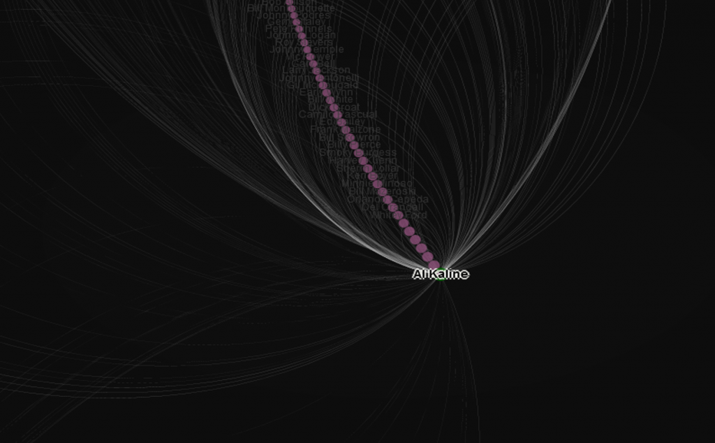
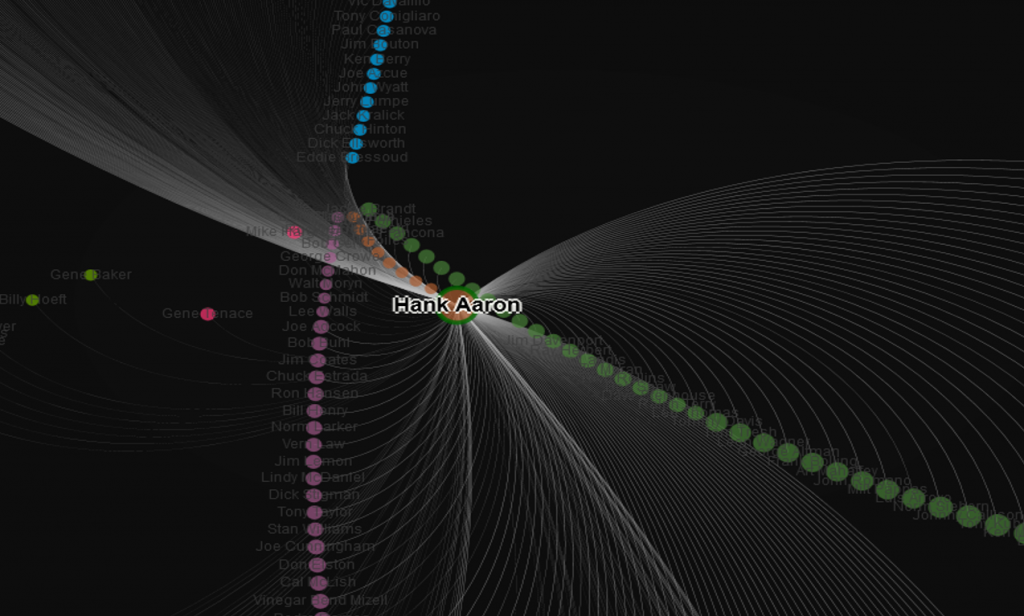
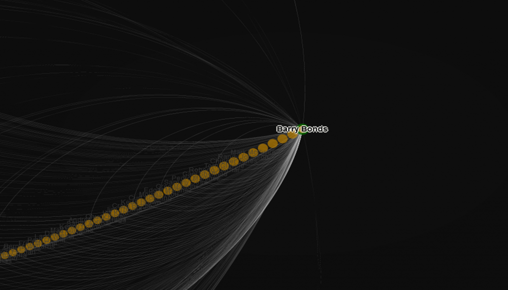
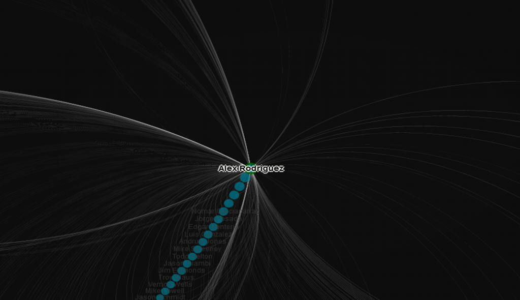
This is the first in a series of posts where I take a look at notoriously one-sided baseball trades, using the baseball trade networks published on this site earlier in 2022. I won’t necessarily rank these deals in any sort of order; rather I will pick out a few from the network trade graphs and provide some analysis and context for some of the most notorious transactions.

If you haven’t seen the trade networks previously, here’s a link.

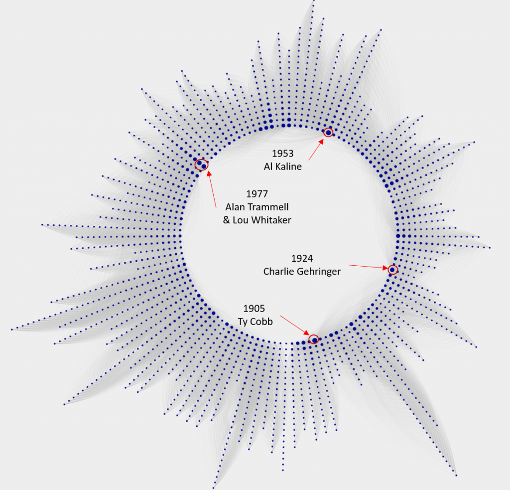
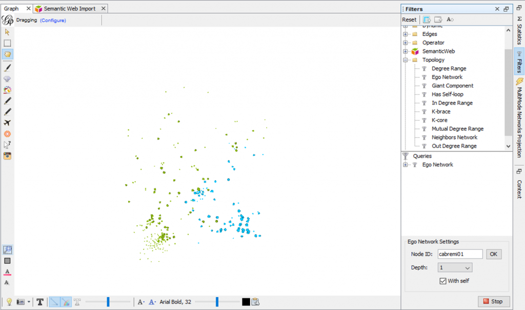
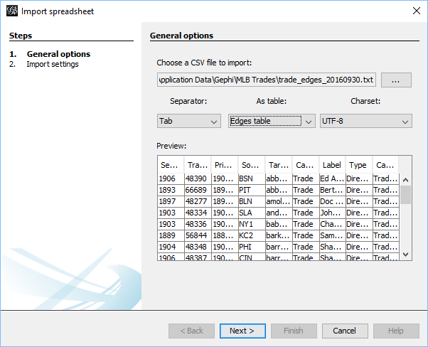
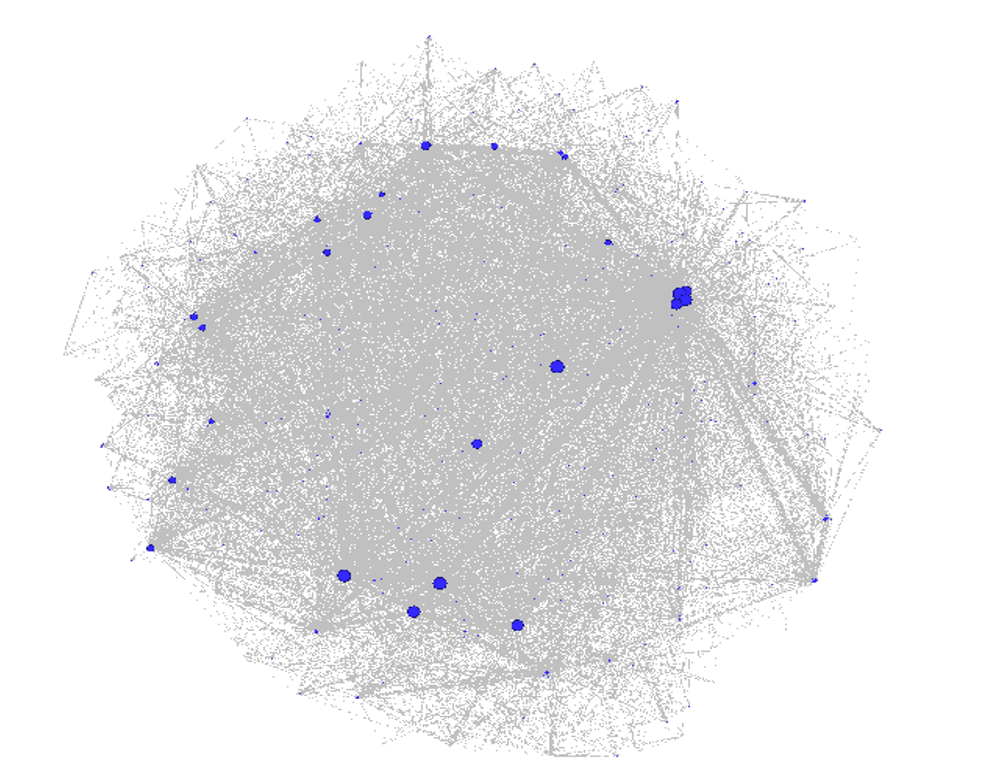
The networks were built using data from Retrosheet and Neil Paine, loaded into Gephi, a network analysis and visualization tool, and ultimately pushed to the web where I could finish styling the graphs. Graph nodes (the circles in the networks) are sized based on the total future WAR (Wins Above Replacement) accrued by the teams involved in the trade. All values must occur at the major league level (MLB), so players involved in the deal who don’t reach the MLB level with their new team will have a zero value. Only the cumulative WAR value while playing for the new team is included; we are not calculating WAR once a player leaves one of the teams involved in the transaction.

Finding a bad trade by scanning the networks is more an art than a science; the key is to look for large nodes (indicating a lot of future WAR value), and then dissecting the trade to see how much value each team received. The other alternative is if we already know the player(s) we are looking for; in these cases we can perform a simple search to find the trade. Here’s a classic example that Red Sox fans would love to forget – trading future Hall of Famer Jeff Bagwell for journeyman reliever Larry Anderson. Let’s go to the Red Sox trade network and search for Jeff Bagwell.

Red Sox trade network

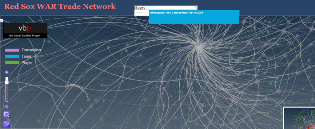
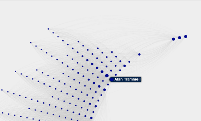
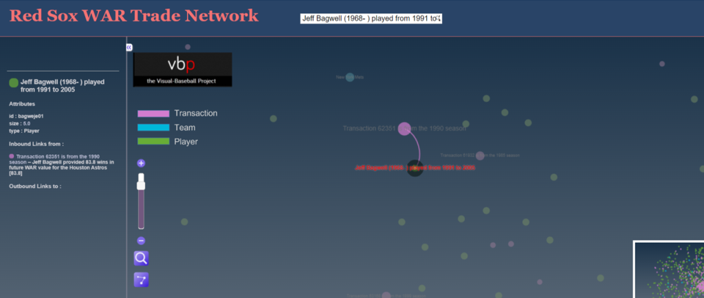
Typing in Jeff Bagwell locates him quickly within the trade network. Note that even if a player is involved in multiple trades to or from the same team (rare but possible) the search will locate each transaction. Here’s the Bagwell transaction, showing his player node and future WAR value connected to the transaction node; every player involved in that transaction will be connected to the trade node, as long as there is some future WAR value. If a player in the trade did not play in the majors for the receiving team, they will not be reflected in the graph. Here’s a view of Jeff Bagwell relative to the trade:

Jeff Bagwell transaction

We can also click on the transaction node to see the value provided to each team by all of the players involved in the trade, again assuming they spent time with the team and were not limited to the minor leagues. Clicking on that node will display the respective WAR values in the sidebar on the left of the screen:

WAR values of the trade

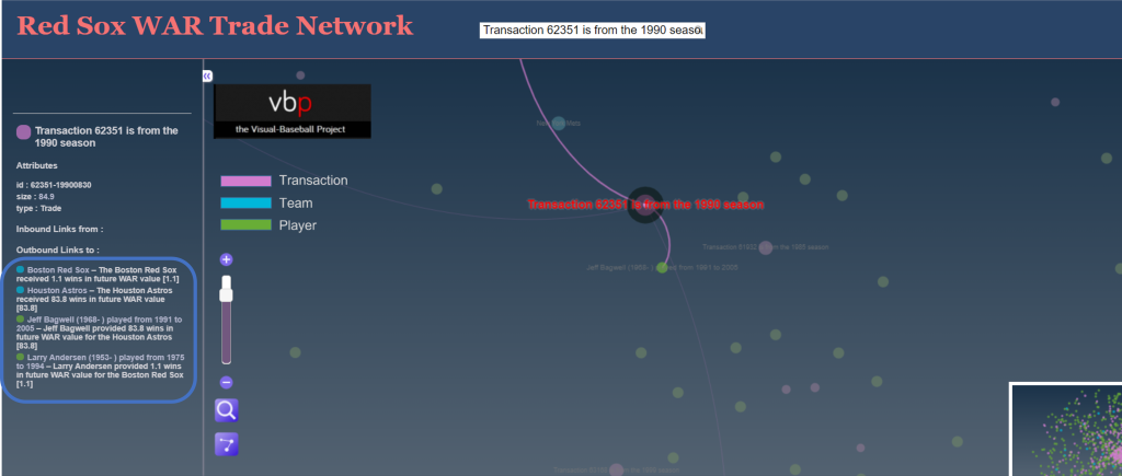
Here’s where we get to the details of the trade, and specifically the direct benefits accrued to each team. The Red Sox received 1.1 future WAR from Larry Anderson; to put this in perspective, we might expect this sort of value for an average player for a single season. The Astros, on the other hand received an incredible 93.8 WAR from Jeff Bagwell, or close to 6 WAR per season for 16 years! That is a Hall of Fame level performance, and it eventually led to his selection to Cooperstown in 2017. Here’s a profile that mentions the one-sided trade.

While we have the Red Sox network open, let’s see if there are any other disastrous transactions (other than the cash sale of Babe Ruth to the Yankees, technically not a trade). After scanning the network, we find this one from 1928:

Transaction 59324 – Buddy Myer

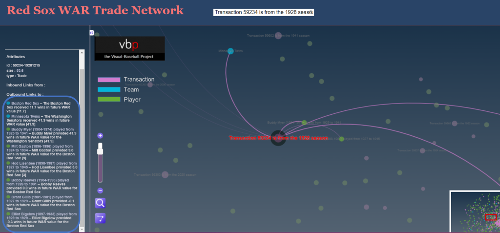
This one is clearly not a Bagwell-level disaster, but was still quite negative for the Red Sox, with a WAR differential of 30 points. The primary villain here is Buddy Myer, a solid infielder who hit .300 or better seven times for the Senators. Not a major star, but the owner of a very nice career, including leading the American League in batting average in 1935.

Let’s try to find one more before closing this piece, this time favoring the Red Sox. We zero in on this deal:

Transaction 59403 – Jimmie Foxx

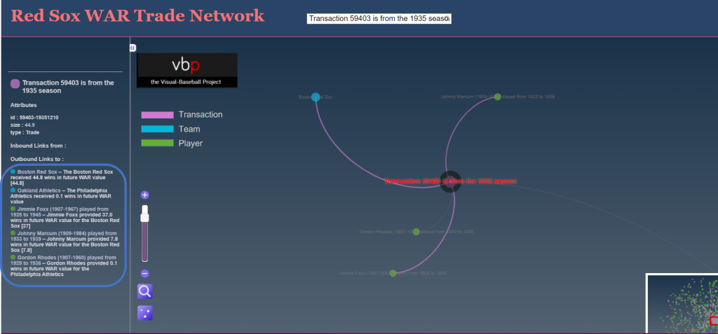
The Red Sox netted nearly 45 future WAR value while surrendering just 0.1; most of the benefit was generated by slugging future Hall of Famer Jimmie Foxx, but they also received a nice three season contribution from pitcher Johnny Marcum. Note how we also removed nodes not involved in the trade by clicking on the edges icon on the bottom left of the display area; this makes it easier to focus on the details.

Feel free to try your hand at finding more of these one-sided deals in the Red Sox or any other trade networks. I’ll be back with some other teams before long. Thanks for reading!

Team Franchise Radial Axis Network Anatomy

A few years back, I created network graphs for many MLB franchises, using data from the Lahman Baseball Database. These graphs displayed the connections between teammates throughout the history of a given franchise from 1901-2013. Any players who were on a roster within the same season (or seasons) were connected to one another, with each node in the network representing a single player. These were then sized to reflect the number of seasons played with that franchise. Every graph was customized by using one or more of their official team colors, resulting in a visualization like this:

A full roster of the live versions can be found here.

Now that 2019 data is available, I thought it was about time to update the graphs, but this time with a new look that might make the graphs a bit more intuitive and perhaps even more visually attractive. Out of this was born the radial axis franchise graph, as shown for the 1901-2019 Detroit Tigers:

I’m pretty excited about the look the Radial Axis layout provides for this sort of data, and I think you’ll see why it is an effective method for visualizing all the players over the course of 119 seasons. Let’s have a look at the anatomy of this graph.

The graph runs in a counter-clockwise manner, starting with 1901 at the bottom of the graph, and working all the way around until we get to 2019, also at the bottom of the graph. Each set of nodes along the way represents the collection of players with their first Tigers season in that radian. We can see some years where there were many new players (1912 has an exceptional number), while other years had very few new players, 1915 being an example. Here’s a general diagram to help with this concept:

We can also identify a handful of players with especially large nodes, which indicate the number of seasons with the Tigers. These are sorted to make the graph clean and easy to interpret; players with the most seasons will all be closest to the center of the graph, with teammates from the same starting year sorted from longest to shortest tenure. The perimeter of the graph will be populated almost exclusively with one-season players.

For context, let’s examine a few of the large nodes, and identify who they are:

I hope this is starting to make sense. Each radian represents a season, and each node on a radian depicts a player, sized by their longevity with the team. The third critical aspect of the graph is the connectivity between players, represented by the thin gray lines running between them. These are called edges, and are at the heart of a network graph. Let’s have a closer look at the edges for Alan Trammell, as one example.

If we click on the Alan Trammell node, the graph is reduced to him and the players he played with over his career – or at least those who were on the roster in those seasons. This is the fun part of the graphs, as it facilitates exploration and pattern discovery. Here is a portion of the Trammell network, zoomed in so we can see the connections:

Now the edges are a bit more visible, and the graph detail begins to reveal itself. Notice the multiple large nodes in line behind Trammell; it turns out that this is the celebrated 1977 class, many of whom would ultimately be members of the great 1984 World Series champs. So while the 1977 Tigers were not a good team, they were beginning to see the fruits of a strong minor league pipeline. In order, here are the players in that group, and their connection to the 1984 team:

  • Alan Trammell (20 seasons, WS Champ)
  • Lou Whitaker (19 seasons, WS Champ)
  • Jack Morris (14 seasons, WS Champ)
  • Lance Parrish (10 seasons, WS Champ)
  • Milt Wilcox (9 seasons, WS Champ)
  • Dave Rozema (8 seasons, WS Champ)

Trammell is obviously connected to many other players who started in different seasons, given his 20 years with the team. In fact, he has a degree measure of 333, representing the number of players with a connection to Trammell. Thus, we can also see many connections to players who started their Tigers journey in other seasons. The three large nodes to the upper right of Trammell are interesting – who are they?

  • Closest to Trammell is John Hiller (1965-80)
  • Next is Mickey Stanley (1964-78)
  • Followed by Willie Horton (1963-77)

What we have here are the three remaining holdovers from the 1968 World Series champs, finishing up their careers just as Trammell was starting his long tenure with the Tigers. Discovering patterns like this make network graphs very interesting for me, and I hope you will also find them interesting. I’m currently in the process of refining the Tigers graph, which will be followed by graphs for each MLB franchise, once again using their team colors to provide some visual context. Hope you found this informative, and we’ll see you soon.

Updating Player Networks – Part 3

In Part 1 of this series, we looked at how to generate node and edge data for all players within a single franchise’s history. Part 2 examined how we could take that data and create a network using Gephi, adding graph statistical measures along the way. In this, the final part of the series, our focus is on moving the graph beyond Gephi and on to the web, where users can interact with the data and interrogate the player network using sigma.js software. So let’s pick up with the process of moving the network from Gephi  to sigma.js.

Recall our basic network structure in Gephi, which looks like this:

One of our goals when we export the graph to the web is to enable user interaction, so the above graph becomes a bit less intimidating. As a reminder, this is at most a moderate sized network; the need to provide interactive capabilities becomes even greater for large networks.

There are a few ways we can create files suitable for web deployment using Gephi. In this case, the choice is to use the simple sigma.js export plugin located at File > Export > Sigma.js template. Selecting this option will provide a set of options similar to this:

This template allows for a modest level of customization, including network descriptions, titles, author info, and other attributes relevant to the network. When all fields are filled to your satisfaction, click on the OK button to save the template. Your network will be saved to the location specified in the blank space at the top of the template window (grayed out in this case). A word of caution is in order here – if you make some custom entries to the template, and then make adjustments to your network, be sure to specify a new location to save the generated files. Otherwise, the initial set will be overwritten. This is especially critical if you have gone behind the scenes to customize colors, fonts, and other display attributes. More on that capability in a moment.

Once the template is complete and the OK button is clicked, a set of folders and files is generated that can then easily be copied to the web. Here’s a view of the created file structure:

These files and sub-folders are all housed within a single folder named ‘network’. If you wish to tinker with your graph in Gephi, rename the network folder to something else prior to exporting a second (or 3rd or 4th time). This will help keep you sane. 🙂

Without going into great detail here, let’s talk about the key files:

  • data.json stores all of your graph data, including positioning attributes, statistics created in Gephi, plus node and edge details
  • config.json contains many of the primary graph settings that can be easily edited for optimal web display. It’s quite easy to go through a trial and error process, since the file is so small. Simply make changes, then refresh your browser to see the result.
  • index.html has a few basic settings relevant to web display, most notably the title information that the browser will use

Within the css folder are .CSS files where you can make changes to many display attributes. This is typically where you will adjust fonts and font sizes, as well as some colors. The js folder has javascript files that can be edited to a certain degree, although caution is recommended if you’re not a javascript guru. Finally, the images folder contains any relevant image files to be used for web display, such as logos.

Alright, now that we have had a brief view of the technical details, let’s have a look at the network graph in the browser. Note that this is still a bit experimental at this stage; I’m attempting to customize each graph based on the official team colors or close variations in the color family.

To see some of the interactive functionality, let’s select a specific player. Simply type Ted Williams (the greatest Red Sox batter of all time) in the search box, and view the results:

Now we see only the direct connections (a 1st degree ego network) for Ted Williams (270 degrees in this case), as well as a wealth of statistical information previously calculated in Gephi, seen in the right panel. At the bottom of the panel are hyperlinks where any one of the 270 connections may be clicked, allowing us to view their network. As you can see, sigma.js quickly provides great interactivity for graph viewers.

Even better, we can scroll in to the network at any time:

Hovering on a node generates a pop-up title for that node, as seen for Ted Williams in this instance. We also begin to see the names of other prominent players at this zoom level. Additional zooming will reveal more player titles – a great way to embed information without making the original graph visually chaotic by displaying all titles at every level.

For the current web version of this graph, click here. I’ll try to keep this version active, even if I make improvements to the final network. Once again, thanks for reading!

Updating Player Networks – Part 2

In our previous post, we looked at how to acquire and load our baseball player data into Gephi. In this second installment, the focus will be on creating a player network graph in Gephi, and customizing many settings to deliver a network graph we can export to the web. Player networks are used to detail the connections between all players who are connected to one another in some fashion. In this instance, it is based on players having played for the same team in one or more common seasons. So let’s begin with the process of creating the graph using our raw data from the first installment.

Importing .csv data into Gephi is quite simple – we create individual node and edge files (as we showed in the previous post), and use the Gephi import functions to pull the data in. I always start with the node file, since it will typically have additional information not included in the edges file. After importing the node data, I then import the edge data, which gives us the information to form our initial graph. If we were to start with the edge file, Gephi will create our node data automatically, and we will not have the detail needed for our graph. This approach may work for simple graphs, but not for our current case.

Once both data files have been imported, we can begin thinking about what we want form our graph. Here are several questions we might pose:

  • How will we use color?
  • What sort of layout will be best?
  • Which measures should we calculate?
  • How should we depict node sizes?

In many cases, the answers to these questions come about through trial and error. We may have some ideas going into the process, but invariably, there will be modifications along the way. So be patient, and be willing to experiment as you create network graphs. The graph you will see in this post went through many of these modifications, which I won’t take the time to detail. Instead, this post will detail my final choices, along with some explanations for why these choices were made. So let’s take a walk through the various facets of the visualization.

Layout

While a network will retain the same underlying structure from a statistical point of view (degrees, centrality, eccentricity, etc.) regardless of our layout choices, it is still important to select a layout that will visually represent the underlying patterns in the network. Otherwise, we could just as well deliver a spreadsheet with all of the network statistics. So layout selection is critical, and often involves an iterative process.

For the baseball network graphs I built in 2014, I eventually settled on the ARF layout algorithm, which ran quickly and created an attractive circular network graph display using the player connection data. Alas, there is no ARF algorithm available for Gephi 0.9.2, so I required a different approach for the updates. Ultimately, this led to a 2-step approach using a pair of layout algorithms – OpenOrd followed by Force Atlas 2. OpenOrd is especially effective at creating a quick layout from large datasets, although with far less precision than some other force-directed approaches. Still, it is a great tool for creating a general understanding of the structure of a network very quickly. Force Atlas 2, is the near opposite of OpenOrd – a very precise approach that can be tweaked easily using the various settings in Gephi. It is ideal for putting the finishing touches on what OpenOrd started.

Here are the settings I eventually settled on for Force Atlas 2, after much trial and error:

Force_Atlas_2

Some of the more important things to note here are the Scaling and Gravity settings. I reduced the scaling to 0.5 so the network would display appropriately in a single window without the need for scrolling. The Gravity setting was increased to 2.5 to force nodes slightly toward the center of the display. The LinLog mode and Prevent Overlap options are also selected in order to make this particular graph more visually effective. For other graphs, I have used the Dissuade Hubs option, forcing large nodes to the perimeter of the graph; in this case, that was not an ideal choice.

Color

The use of color is also important within a network graph display. Color can be used to highlight nuances in the data that distinguish one or more nodes relative to another group of nodes. Often we use color to visually represent clusters within the graph, as grouped using the modularity classes statistic or some similar input. In the case of this series of graphs (ultimately one graph per team), I made a decision to use the official team colors to differentiate each graph. Thus my initial graph for the Boston Red Sox would be based on the two primary hex colors for the current team (these colors do change over time for many teams).

Here are the Red Sox primary colors:

c8102e_Color_Hex_-_2018-06-10_09.15.48 0c2340_Color_Hex_-_2018-06-10_09.16.33

After capturing current team colors in a spreadsheet for easy reference, I used the color-hex.com site to select complementary colors for the Red Sox graph. Using complementary colors allows me to differentiate clusters in the graph while remaining true to the original concept of employing team colors for each graph. So instead of a wide range of colors one would normally see in a Gephi output, I was able to input the complementary colors for each group. Thus, one team color could be used for the graph background, while the other color (and it’s complements) could be used for the graph structure (nodes & edges). We’ll share the effect later in this post.

Statistics

Graph statistics are critical to the full understanding of the structure of a network. While we can view a graph and begin to understanding the general structure of a network, the various statistics will aid and reinforce our initial visual comprehension. Gephi provides a nice range of statistical measures to choose from:

  • Eccentricity (the number of steps needed to traverse the network)
  • Centrality – betweenness, eigenvector, closeness, harmonic closeness (various measures of importance of an individual node)
  • Clustering coefficient (to discern cliques in the network)
  • Number of triangles (a friends of friends measure)
  • Modularity Class (clusters)
  • Degrees (the number of connections)

Sizing

Node sizing is another key element of effective graph design. In this case, there were a few options I could pursue for node sizing – the number of seasons played (I used this in the 2014 graphs), one of the various centrality measures we calculated, or the number of degrees (connections) an individual player possesses. After computing each of these statistics, I eventually decided to use the number of degrees as a representation of influence in the graph. Visually, I want to show how many other players a single individual is related to, and using node size is an effective means of doing so.

Summary

Our final graph in Gephi is shown below; the eventual web-based version will differ slightly and include additional functionality, but that’s for another post.

red_sox_20180610

Next Post

My third and final post in this series will address exporting this graph to the web using the sigma.js plugin, and making some additional customization to the web version. Thanks for reading, and see you soon!


Updating Baseball Team Networks – Part 1

A few years back, I used Gephi and sigma.js to create a series of interactive baseball team networks, one for each current MLB franchise. These networks displayed all players through the 2013 season, going all the way back to 1901 for the original American and National League franchises. Now that we have data through the 2017 season, it’s time for an update, not only from a data perspective, but also stylistically. This post will walk through the process of creating one of these networks using Toad for MySQL, Gephi, and sigma.js to create web-based interactive network visualizations.

Here’s a typical network from the 2013 series; the full list of networks can be found here. We’ll use the existing networks as a baseline for the new networks, although a few modifications will be made.

baseball_team_network_2013
a 2013 baseball team network for the Boston Red Sox

Source Data & MySQL Queries

Let’s start our discussion with the source data. Season-level baseball data is available through the seanlahman.com website, in the form of .csv files or Microsoft Access database tables. I use the .csv format, as it can be easily added to existing MySQL databases on the visual-baseball.com server. MySQL also makes it simple to add derived fields through some simple coding. These fields can be utilized later for a variety of activities.

For the purpose of our network graphs, there are a handful of critical fields we want to use. These include the following:

  • playerID, a unique identifier for every player who ever donned a major league uniform
  • player name, which can be used to provide a meaningful reference based on the playerID field
  • yearID, which refers to the season (or seasons) a player suited up for a specific franchise
  • franchID, a unique identifier for each MLB franchise

We also need to do a little manipulation of the source data in our code to deliver our results in the proper form for use in Gephi. This means we need to create two input files – one for nodes, and a second for edges. The nodes will contain information about each player, the number of seasons played for the franchise and the first and last seasons, which may differ from the number of seasons, as players frequently leave a franchise only to return later in their career. Here’s our node code:

SELECT Id, Label, MAX(Size) as Size
FROM
(SELECT bp.playerID AS Id, CONCAT(bp.name, ” “, MIN(bp.yearID), “-“, MAX(bp.yearID)) AS Label, COUNT(bp.yearID) AS Size
FROM BattingPlus bp
WHERE bp.franchID = ‘BOS’ and bp.yearID >= 1901
GROUP BY bp.name

UNION ALL

SELECT pp.playerID AS Id, CONCAT(pp.name, ” “, MIN(pp.yearID), “-“, MAX(pp.yearID)) AS Label, COUNT(pp.yearID) AS Size
FROM BattingPlus pp
WHERE pp.franchID = ‘BOS’ and pp.yearID >= 1901
GROUP BY pp.name)  a
GROUP BY Id
ORDER BY Id;

Here’s the simple interpretation – since we are attempting to display all players for a given franchise, we are executing a UNION ALL statement to combine batters and pitchers into a single result file. We have used the playerID field to create the required Id value for Gephi, while also creating a Label field by combining the player’s name with their first and last years playing for this franchise. Finally, we have created a Size field based on the number of seasons played for the franchise. We can then choose to use this in Gephi to size each node, if we so choose.

We also need to create the edge file for Gephi. In this case, we want to understand how many seasons two players were on the same team. This code is a bit trickier, since we want to show only one connection between two players, since this will be an undirected graph. More on that distinction later. Here’s our edge code:

SELECT b.playerID AS Source, m.playerID  AS Target,  ‘Undirected’ as Type,  ‘ ‘ as Id, ‘ ‘ as Label, count(*) as weight
FROM
(SELECT a.playerID, CONCAT(m.nameFirst, ” “, m.nameLast) name, a.yearID, a.franchID

FROM Appearances a
INNER JOIN Master m
ON a.playerID = m.playerID

WHERE a.franchID = ‘BOS’ and a.yearID >= 1901) b

INNER JOIN Appearances a
ON b.yearID = a.yearID and b.franchID = a.franchID and b.playerID <> a.playerID and a.playerID > b.playerID
INNER JOIN Master m
ON a.playerID = m.playerID

GROUP BY b.playerID, a.playerID
ORDER BY b.playerID

Here we use the Master table to provide player name information, and we also gather the ID information to match the node values. The critical piece in this code is in our join criteria:

INNER JOIN Appearances a
ON b.yearID = a.yearID and b.franchID = a.franchID and b.playerID <> a.playerID and a.playerID > b.playerID

Here we are matching players based on the same season and the same franchise. We then specify that we do not want to connect any player to himself, and that we want only values where the playerID value from our main query is greater than the playerID value from the sub-query. This gives us a single connection between two players, which is what we need for an undirected graph. We then define a Source node (required by Gephi) and a Target node (also required), as well as specifying ‘Undirected’ as the graph type. We leave the ID and Label values empty, and then summarize the number of seasons played together as an edge weight. This value can be used in Gephi to show the strength of a connection between two nodes (e.g.- did they spend one season together, or 10 seasons together?).

After exporting each of these files to a .csv format, we have our source data for Gephi. In Part 2 our focus will shift to creating the network in Gephi.

Player Ego Network Visualization

Ego networks are an interesting concept within the realm of network visualization using graph analysis, as they allow us to easily see direct connections within the network of a particular individual. Using Gephi, we can navigate large networks using this technique, which enables us to filter and view only those connections relevant to our current criteria. All remaining nodes and edges are simply filtered out from a visual perspective, giving a very clean look at individual networks. The ego network can be set to a depth of 1 if the goal is to show only direct connections, or to 2 or even 3 if our goal is to see the so-called “friends of friends” via indirect connections.

My latest venture uses a network of all MLB players between 1901 and 2015, which consists of a somewhat unwieldy mass of nearly 17,000 players with close to 1.2 million connections. Even when we cluster the results using Gephi’s modularity class option, it is still a difficult network to navigate, both from a visual perspective and a resource allocation viewpoint. Here’s a view of the network as a whole:

mlb_players_20161230

While the modularity class coloring helps identify groups of related players, there is an awful lot of small detail that is not easily discerned, and the graph is computationally expensive, often crashing my version of Gephi if I try to do too many things with the full graph. Fortunately, ego networks are a great way to filter the data for greater understanding of some of the details within the network.

Using the ego network option as a filter, I am able to view the individual network of any player in the graph with ease. Here’s a look at my settings for the Miguel Cabrera ego network, and the resulting network, which is now a very manageable 300 nodes and 11k edges:

mlb_ego_filter_20161230

With a little editing in Gephi, such as increasing the size and adjusting the color for the central node, I can easily create a series of ego networks that can later be exported to a JSON format for use with Sigma.js. These can then be turned into interactive web-based networks quite easily. Here, we change the existing node settings so that the Cabrera node stands out in the graph. First, we locate Cabrera’s record in the data worksheet, and then select the node edit menu option:

mlb_edit_node1_20161230

This then takes us to the node properties, where size and color can be edited:

mlb_edit_node2_20161230

If this step causes some overlap in the graph, we can easily run the Noverlap layout algorithm to optimize graph spacing. Here’s a view of the completed Cabrera network after using Sigma.js and tweaking a few of the config settings:

Cabrera_20161130

As of now, there are five of these ego networks available for viewing on the visual-baseball site. They can be found here. I promise more to come in 2017 as time permits. Update – 25 networks as of 1/15/2017.

Major League Baseball Trade Networks, Part 2

Welcome to Part 2 in our miniseries on building baseball (MLB) trade networks with Gephi. In the first post, the focus was on procuring and preparing the data using MySQL. The goal was to create nodes and edges that could be easily imported to Gephi. Gephi does allow for some data manipulation post-import, but I’ve learned from experience to do the main parts of the job with either SQL code or within spreadsheet software like Excel or Calc.

With our data readied for import, we’ll now move on to the more fun parts of the process, where we get to visualize the data and see any underlying patterns. Gephi is an ideal tool for this, as it allows us to try out many different algorithms, especially in version 0.8.2. The newer 0.9 versions are faster, but have not fully caught up on the plugin side at this writing, so options are a bit more limited. One other caveat – I frequently run into Java issues when using Gephi, so save your work often and be prepared to shut down and restart Gephi periodically.

We’ll kick off this part of the process by importing the data, nodes first, followed by edges. The reason I prefer this order is that nodes will be automatically created if we start with the edge file import, and they won’t contain any extra fields you may have added using your database or spreadsheet processes.

Here’s the node import window, showing the appropriate file input:

Gephi node import window

Once the node import process is complete, we turn to the edges file, and follow a similar sequence of steps. Here’s our starting point:

Gephi edge import window

After the data has been imported, it’s time to move to the Overview tab, where we’ll see a dense mess of nodes and edges, especially if we have a fair sized dataset. Something like this:

Impossibly dense hairball network

Gephi offers a variety of interesting algorithms, each more or less appropriate based on the underlying dataset. In our case, the dataset is of a moderate size, with more than 8,000 nodes and nearly 62,000 edges. This immediately rules out the use of simple layouts such as the circular algorithms, as it would prove immensely challenging to display, even when we take it to an interactive output. At the other end of the sophistication level lie the force-directed layouts, which apply a significant dose of science and math within their respective algorithms. In Gephi, the Force Atlas 2 is quite popular, but it tends to run very slowly unless coupled with enormous levels of RAM. So where to go with our choice for this data?

I elected to take a two step approach, using the extremely fast (if less precise) OpenOrd algorithm for the original data. This provides a nice view of the network within a few minutes, making it a good starting point for our next steps.

Trade network with OpenOrd layout

The goal of this exercise was to create team level graphs, which will each have a small subset of the entire dataset. One easy way to achieve this is to use the Ego Network filter to select a single team and its connections. Setting the ego network to a depth of 1 limits the display to only first degree connections; in this case players traded to or from our selected team.

Ego network with depth = 1

Once this step has been taken, we can then refine the display by applying another algorithm; in this case I have chosen the Yifan Hu option, and adjusted the settings until they created an aesthetically pleasing graph. The Yifan Hu adds further precision within each of the team graphs, and provides them with a common look & feel inasmuch as their respective data allows.

We have now completed our basic graph creation in Gephi, and can output our results to a variety of output formats. Our choice here is to create a GEXF file, which we can then plug in to an existing template. We do have another step with respect to the GEXF data. In order to relate the graphs back to their respective teams, I chose to apply official team colors to elements in the graph. Specifically, each node should reflect the individual team; we want the edges to remain the same across all graphs so that users have a common understanding for the types of connections between players and teams. So to update the node colors, simply use a code editor that can perform batch updates. I typically work with Brackets for this task, but choose your tool of choice. Here’s a view of the GEXF output prior to applying color changes:

GEXF nodes with original colors

Now here’s the updated version that reflects the Tigers navy blue coloring:

GEXF nodes updated with team colors

Once this step has been completed, I can upload the files to the web server, where other minor changes can be made. These include any updates to the CSS styling, adjustments to the config.js file, and minor changes to the index.html file so the proper team information is displayed. The easiest way to do this is to create a common set of directories for the basic javascript and CSS files, leaving only the individual config, html, and gexf files in each team’s directory.

After a bit of massaging the config and CSS settings, the result is visually appealing as well as highly functional. Here’s a zoomed in look at the Toronto Blue Jays network on the web:

Blue Jays trade network close-up

All of the networks can be found by clicking the link below, with new ones being added until all teams have been represented:

Trade Networks

If you want to see each network in its own window or tab, use the right-click options in Firefox or Chrome.

I hope this has been helpful, and please feel free to reach out via the LinkedIn or Facebook Gephi groups, or leave a comment on this site.

Thanks for reading!

Major League Baseball Trade Networks, Part 1

One topic that has long fascinated me as network graph material is trade data between major league baseball (MLB) teams. I have previously created a static visualization showing activity at a macro level, i.e.- the number of trades between teams over a 100+ year period. Yet there was a desire to do something more, and to make it interactive so users would be able to sift through the data for their favorite teams to understand trade patterns through a visual representation. Today, after weeks spent tinkering with this topic, I finally have something to share, and will walk through how it is created and how to engage with it online. If you want to play with it before reading further, visit the Tigers trade network.

Here’s what we’ll wind up with:

Tigers trade network

My tools of choice in this endeavor are familiar ones to anyone working with baseball data, network graphs, or perhaps both, although I haven’t seen many instances of the latter. The trade data can be found at Retrosheet, as part of a seemingly boundless array of baseball data, both statistical and historical in nature. Gephi, the open source network analysis tool is again my choice for creating the network structure from the raw data, and Sigma.js is once more the tool for web implementation. Mix in a bit of Excel and PowerPoint for good measure, and we have all the tools necessary to create a pretty cool (IMHO) finished graph.

So let’s get started. Our first step is to go to the Retrosheeet site and download trade data, found at Retrosheet transactions. Be aware that there is much more than trade data in this dataset; free agent transactions, releases, and many other transaction types are available. My approach is to grab the entire dataset, which I can then load into a MySQL database for filtering and matching to other baseball data from both Retrosheet and the Lahman archives. For our example, only trades will be used; this leaves open the future possibility to examine free agent signings or other transaction types.

Once I have the data in MySQL (I’m purposely skipping over this process), the coding steps begin. This was a very iterative process as I gradually figured out how Gephi would play with the output data, but I won’t bore you with my multiple missteps. Instead, let’s have a look at the code snippets, and I’ll explain their usage and the thought process behind them. We’ll start with a view of the code, created within the (free) Toad for MySQL tool. In creating this code, we need to understand how Gephi (or other network analysis tools) work. At the risk of over-simplifying, Gephi only needs nodes and edges. Nodes will represent the players or teams in our visual, while edges will show the linkages within a single trade – who was traded for whom, and which players moved together from one organization to another.

Node creation is simple – we just grab all players involved in a trade, and do likewise for all teams. Here’s the code for players:

SELECT t.Player as Player, CONCAT(m.nameFirst, ” “, m.nameLast) as Name, count(*) as transactions

FROM trades2015 t
INNER JOIN Master m
ON t.Player = m.retroID

WHERE t.Type = ‘T’ and (t.TeamFrom > ‘A’ OR t.TeamTo > ‘A’)
GROUP BY t.Player, CONCAT(m.nameFirst, ” “, m.nameLast)

All we’re doing here is creating a node size for each player, based on the number of trades they are involved in.

For Teams, the logic is a bit more complex; since team names have changed from season to season, we need to join on both team and season to get the correct name assignments. We also want to account for the direction of each transaction, which we do using a UNION query.

SELECT b.Team AS Id, b.Name As Label, SUM(b.transactions) as Size
FROM
(SELECT t.TeamFrom as Team, te.name as Name, count(*) as transactions

FROM trades2015 t
INNER JOIN Teams te
ON te.teamID = t.TeamFrom and t.Season = te.yearID

WHERE t.Type = ‘T’ and t.TeamFrom > ‘A’
GROUP BY t.TeamFrom, te.name

UNION ALL

SELECT t.TeamTo as Team, te.name as Name, count(*) as transactions

FROM trades2015 t
INNER JOIN Teams te
ON te.teamID = t.TeamTo and t.Season = te.yearID

WHERE t.Type = ‘T’ and t.TeamFrom > ‘A’
GROUP BY t.TeamTo, te.name) b
GROUP BY b.Team, b.Name

After running the queries, we have results that can be posted into Excel or other spreadsheet software, where a tab-delimited file can be saved for use in Gephi. Our file data looks like this:

Id Label Size
aardd001 David Aardsma 4
aaroh101 Hank Aaron 1
aased001 Don Aase 1
abadf001 Fernando Abad 1
abbae101 Ed Abbaticchio 1
abbeb101 Bert Abbey 1
abbof101 Fred Abbott 1
abboj001 Jim Abbott 2

and for the team entries:


OAK Oakland Athletics 936
PH4 Philadelphia Athletics 6
PHA Philadelphia Athletics 355
PHI Philadelphia Blue Jays 28
PHI Philadelphia Phillies 1445
PHI Philadelphia Quakers 3
PIT Pittsburg Alleghenys 9
PIT Pittsburgh Pirates 1416

This is all Gephi requires for displaying nodes – an ID, a Label, and size. Even the label and size are not required fields, but they do make things easier if done in advance. So far, so good. Next we’ll move on to the somewhat more involved process of creating edge files.

As I progressed deeper into this project, it became evident to me that there were four different types of edges to display. The first two were obvious and easy – players being traded to a team, or from a team. Yet I also wanted to see the other players involved in each transaction, which necessitated the addition of two more edge type – traded with other players, and traded for other players. Note that in many cases just two or three of these might come into play, and for many prominent players, we’ll have none at all. Thus, the likes of an Al Kaline or Ted Williams will not be found in any of these graphs, as they remained with a single team for their entire careers.

Here’s the final edge code I wound up with to create the four categories of trades to be displayed in a graph. Gephi requires three edge attributes – a source value, a target value, and an edge type. The edge type must be either undirected or directed; for our graph, all edges will be directed, since we intend to show the bi-directional movements within each transaction. The first bit of code is for instances where a player was traded from a team:

SELECT tr.Season, tr.TransactionID, tr.PrimaryDate, tr.TeamFrom AS Source, tr.Player as Target,
CASE WHEN tr.Type = ‘T’ THEN ‘Trade’ WHEN tr.Type = ‘F’ THEN ‘Free Agent Signing’ WHEN tr.Type = ‘Fg’
THEN ‘Free Agent Granted’ WHEN tr.Type = ‘R’ THEN ‘Release’ END as Category,
CONCAT(m.nameFirst, ” “, m.nameLast, ” “, CASE WHEN tr.Type = ‘T’ THEN ‘Traded’ WHEN tr.Type = ‘F’ THEN ‘Free Agent Signing’ WHEN tr.Type = ‘Fg’
THEN ‘Free Agent Granted’ WHEN tr.Type = ‘R’ THEN ‘Released’ END, ” on “, tr.PrimaryDate, ” from “, t.name) AS Label, ‘Directed’ as Type, ‘Traded From’ as CategoryDetail

FROM trades2015 tr
INNER JOIN Master m ON tr.player = m.retroID
INNER JOIN Teams t ON tr.TeamFrom = t.teamIDretro and t.yearID = tr.season

WHERE tr.type = ‘T’

Note the legacy code covering free agency and releases, rendered moot by the WHERE clause. These will have to wait for another set of graphs. In a similar fashion we have code for trades where a player comes to a team.

SELECT tr.Season, tr.TransactionID, tr.PrimaryDate, tr.Player AS Source, tr.TeamTo as Target,
CASE WHEN tr.Type = ‘T’ THEN ‘Trade’ WHEN tr.Type = ‘F’ THEN ‘Free Agent Signing’ WHEN tr.Type = ‘Fg’
THEN ‘Free Agent Granted’ WHEN tr.Type = ‘R’ THEN ‘Release’ END as Category,
CONCAT(m.nameFirst, ” “, m.nameLast, ” “, CASE WHEN tr.Type = ‘T’ THEN ‘Traded’ WHEN tr.Type = ‘F’ THEN ‘Free Agent Signing’ WHEN tr.Type = ‘Fg’
THEN ‘Free Agent Granted’ WHEN tr.Type = ‘R’ THEN ‘Released’ END, ” on “, tr.PrimaryDate, ” to “, t.name) AS Label, ‘Directed’ as Type, ‘Traded To’ as CategoryDetail

FROM trades2015 tr
INNER JOIN Master m ON tr.player = m.retroID
INNER JOIN Teams t ON tr.TeamTo = t.teamIDretro and t.yearID = tr.season

WHERE tr.type = ‘T’

Next, it’s time to create linkages with players from the same transaction, first those moving in the same direction (traded with) in the trade.

SELECT tr.Season, tr.TransactionID, tr.PrimaryDate, tr.Player AS Source, tr2.Player AS Target,
CASE WHEN tr.Type = ‘T’ THEN ‘Trade’ WHEN tr.Type = ‘F’ THEN ‘Free Agent Signing’ WHEN tr.Type = ‘Fg’
THEN ‘Free Agent Granted’ WHEN tr.Type = ‘R’ THEN ‘Release’ END as Category,
CONCAT(m.nameFirst, ” “, m.nameLast, ” “, CASE WHEN tr.Type = ‘T’ THEN ‘Traded’ WHEN tr.Type = ‘F’ THEN ‘Free Agent Signing’ WHEN tr.Type = ‘Fg’
THEN ‘Free Agent Granted’ WHEN tr.Type = ‘R’ THEN ‘Released’ END, ” on “, tr.PrimaryDate, ” with “, m2.nameFirst, ” “, m2.nameLast) AS Label, ‘Directed’ as Type,
‘Traded With’ as CategoryDetail

FROM trades2015 tr
INNER JOIN trades2015 tr2
ON tr.TransactionID = tr2.TransactionID
INNER JOIN Master m ON tr.player = m.retroID
INNER JOIN Master m2 ON tr2.player = m2.retroID

WHERE tr.type = ‘T’

Note the need to duplicate the Master table in the code, since we now require multiple player names to populate the Source and Target fields in Gephi. The same holds true for our last snippet, where players are traded for one another.

SELECT tr.Season, tr.TransactionID, tr.PrimaryDate, tr.Player AS Source, tr2.Player AS Target,
CASE WHEN tr.Type = ‘T’ THEN ‘Trade’ WHEN tr.Type = ‘F’ THEN ‘Free Agent Signing’ WHEN tr.Type = ‘Fg’
THEN ‘Free Agent Granted’ WHEN tr.Type = ‘R’ THEN ‘Release’ END as Category,
CONCAT(m.nameFirst, ” “, m.nameLast, ” “,CASE WHEN tr.Type = ‘T’ THEN ‘Traded’ WHEN tr.Type = ‘F’ THEN ‘Free Agent Signing’ WHEN tr.Type = ‘Fg’
THEN ‘Free Agent Granted’ WHEN tr.Type = ‘R’ THEN ‘Released’ END, ” on “, tr.PrimaryDate, ” for “, m2.nameFirst, ” “, m2.nameLast) AS Label, ‘Directed’ as Type,
‘Traded For’ as CategoryDetail

FROM trades2015 tr
INNER JOIN trades2015 tr2
ON tr.TransactionID = tr2.TransactionID
INNER JOIN Master m ON tr.player = m.retroID
INNER JOIN Master m2 ON tr2.player = m2.retroID

WHERE tr.type = ‘T’

Each of these bits of code outputs results, which are then copied and pasted into our edges spreadsheet. Here are five rows showing each of our four trade categories:

Season TransactionID PrimaryDate Source Target Category Label Type CategoryDetail
2010 62908 20100731 KCA ankir001 Trade Rick Ankiel Traded on 20100731 from Kansas City Royals Directed Traded From
2010 60709 20100831 TEX ariaj001 Trade Joaquin Arias Traded on 20100831 from Texas Rangers Directed Traded From
2010 62264 20101118 COL barmc001 Trade Clint Barmes Traded on 20101118 from Colorado Rockies Directed Traded From
2010 72627 20101217 TBA bartj001 Trade Jason Bartlett Traded on 20101217 from Tampa Bay Rays Directed Traded From
2010 72622 20100709 TEX beavb001 Trade Blake Beavan Traded on 20100709 from Texas Rangers Directed Traded From

2010 62908 20100731 ankir001 ATL Trade Rick Ankiel Traded on 20100731 to Atlanta Braves Directed Traded To
2010 60709 20100831 ariaj001 NYN Trade Joaquin Arias Traded on 20100831 to New York Mets Directed Traded To
2010 62264 20101118 barmc001 HOU Trade Clint Barmes Traded on 20101118 to Houston Astros Directed Traded To
2010 72627 20101217 bartj001 SDN Trade Jason Bartlett Traded on 20101217 to San Diego Padres Directed Traded To
2010 72622 20100709 beavb001 SEA Trade Blake Beavan Traded on 20100709 to Seattle Mariners Directed Traded To

2010 62908 20100731 ankir001 blang001 Trade Rick Ankiel Traded on 20100731 for Gregor Blanco Directed Traded For
2010 62908 20100731 ankir001 chavj001 Trade Rick Ankiel Traded on 20100731 for Jesse Chavez Directed Traded For
2010 62908 20100731 ankir001 collt001 Trade Rick Ankiel Traded on 20100731 for Tim Collins Directed Traded For
2010 60709 20100831 ariaj001 franj004 Trade Joaquin Arias Traded on 20100831 for Jeff Francoeur Directed Traded For
2010 72627 20101217 bartj001 figuc001 Trade Jason Bartlett Traded on 20101217 for Cole Figueroa Directed Traded For

2010 62908 20100731 ankir001 farnk001 Trade Rick Ankiel Traded on 20100731 with Kyle Farnsworth Directed Traded With
2010 66840 20101219 betay001 greiz001 Trade Yuniesky Betancourt Traded on 20101219 with Zack Greinke Directed Traded With
2010 72622 20100709 beavb001 luekj001 Trade Blake Beavan Traded on 20100709 with Josh Lueke Directed Traded With
2010 72622 20100709 beavb001 smoaj001 Trade Blake Beavan Traded on 20100709 with Justin Smoak Directed Traded With
2010 62908 20100731 blang001 chavj001 Trade Gregor Blanco Traded on 20100731 with Jesse Chavez Directed Traded With

We have now successfully prepared the data for Gephi. In our next post, I’ll examine the process starting with the Gephi data import phase. Thanks for reading!

A Network Graph of MLB All-Stars

With the Major League Baseball All-Star game this week, I was suddenly possessed by an urge to create a network graph of all the players who have been selected for the game from 1933-2015. The goal, as with most of my network graph efforts, was to see where the data took me, and what stories it might tell. Along for the ride was my trusty companion Gephi, version 0.9.1 in this instance. Data for this exercise comes, as it so often does, from the Lahman baseball database, which happens to have a nice table with all the necessary all-star information.

The challenge inherent in this data, as with many temporal datasets, is to create an interesting graph that isn’t entirely driven by the time element, in this case as baseball seasons. Some otherwise excellent layout algorithms tend to turn this sort of data into long, worm-like displays that are not visually appealing. I could just as easily use a timeline if that were the goal of the visualization. So in an effort to balance aesthetics with the underlying data, I finally settled on the radial axis layout in Gephi. With this layout, we have the ability to create multiple axes radiating from the center of the graph, grouped by something meaningful. In this case, that turns out to be the modularity class, a sort of clustering mechanism that groups nodes together based on common or similar characteristics.

After some trial and error, I wound up with 13 distinct classes, a nice manageable number for this type of display. The end result can be interpreted as some sort of exotic, colorful starfish, or perhaps as a multi-colored fireworks display. In any event, I believe it tells an interesting story in a visually appealing manner, and allows for understanding the common threads within each cluster of players. Here’s the complete graph layout:

allstar_graph_base

I’ll spend the rest of the post with some quick analyses of each group, and then point you to the entire graph in interactive form so you can discover your own patterns and learn more about the all-star connections of individual players. I’ll also provide a quick overview for how to read the sidebar output for the graph when you interact with the data.

Our 13 clusters (you can think of them as cohorts) tell us some interesting things about the history of all-star participants. Let’s walk through each of the 13 (numbered 0 through 12) to learn more. The clusters begin with 0 (in green) at the upper left and move counter-clockwise around the graph. Each is rank ordered from small to large radiating out from the center, so the member with the most years as an all-star will be at the tip of each group. That individual will serve as our focal point in each of the following screenshots, followed by a brief overview of other members of the cohort.

First up is our Cohort 0, headlined by Miguel Cabrera, with 10 selections through 2015. Obviously, this would appear to be a cohort of current or recent all-stars based on Cabrera’s appearance. We can easily navigate the graph to see if that’s the case. Who else is prominent in the group? Yadier Molina, Matt Holliday, and Robinson Cano, to name a few, all big name stars for most of their careers. How about at the low end of the spectrum, players with a single all-star selection? Here’s where we find the likes of Billy Butler, R.A. Dickey, and Melky Cabrera. All long-tenured, noteworthy players, but certainly not in the same category as the first group.

allstar_0

Cohort 1 takes us on some time travel, with Johnny Mize as the representative star, also with 10 all-star selections and Hall of Fame membership as well. Joining Mize in the group are Bobby Doerr, Vern Stephens, Joe Gordon, and Bob Feller, all Hall of Famers with the exception of Stephens. At the other end of the cohort, each with one appearance, are Oscar Grimes, Red Barrett, and Nick Etten, among others. Based on the career arcs of the stars in this group, we could characterize it as primarily a 1940s-based cohort, certainly with overlap into the surrounding decades.

allstar_1

Derek Jeter is our icon for Cohort 2, so it figures to be a group that immediately precedes the Cabrera-led Cohort 0. Perhaps the focus here will be on stars from the early 2000s, at the center point of Jeter’s long career. Mariano Rivera, Albert Pujols, and David Ortiz are among the top stars here, confirming the hypothesis that this group is largely post-2000 in nature. Among the lesser knowns with a single selection each are Gil Meche, Joe Crede, and Ryan Ludwick.

allstar_2

Cohort 3 is headed up by the legendary Stan Musial, whose career covered the entirety of the 40s and 50s. Given that Cohort 1 was largely concentrated on players from the 40s, we might anticipate more of a skew towards 1950 and beyond. We’ll see in a moment if that’s true. Next to Musial we have Ted Williams and Warren Spahn, two more whose careers spanned both decades, so perhaps we have players here with greater longevity compared to the Mize cohort. Let’s go a bit deeper, where we find Roy Campanella, Larry Doby, and Robin Roberts, all with career pinnacles primarily in the 50s. So while there will certainly be connections across the two groups, Cohort 3 does appear to span more of the 1950s compared to Cohort 1.

allstar_3

With Cohort 4 we see a very large group fronted by all-time hits leader Pete Rose. So we could be focused on the 1960s or 1970s here; Rod Carew, Reggie Jackson, and Mike Schmidt, Hall of Famers all, are included, so the 1970s would seem to be the dominant theme. Perhaps we shouldn’t be surprised at the size of this group, as expansion in the 1960s afforded more players the opportunity to become an all-star. A few interesting figures can be found at the single game end of the radian – Bob Horner, Kent Hrbek, and Lonnie Smith, all with at least momentary brushes with greatness, but good enough to qualify for just one all-star nod apiece.

allstar_4

Joe DiMaggio is the lead for our next group, joined by the likes of Mel Ott, Bill Dickey, and Joe Medwick. The skew is toward the late 1930s and beyond; many members of this cohort would have had limited all-star game opportunities, as the game originated only in 1933. As proof of this, we find Hall of Famers Heinie Manush, Goose Goslin, and Kiki Cuyler at the low end of the radian, each with just a single all-star credit.

allstar_5

Hall of Famer Al Kaline heads up Cohort 6, so we know we’re in either the 50s or 60s, or more likely, a bit of both decades. Along with Kaline we have Mickey Mantle, Yogi Berra, and Ernie Banks, each of who had multiple appearances covering both decades. At the more modest end of the group we find Rocky Bridges, Bob Cerv, and perhaps surprisingly, the slugger Joe Adcock, each with just a single season as all-stars.

allstar_6

Cohort 7 is our one group that’s difficult to explain. Our graph modularity settings forced a small cohort of just nine players; Hank Aaron with 21 seasons, and eight others with a single season each. Consider this one a bit of a fluke.

allstar_7

The great Willie Mays leads the relatively small Cohort 8, joined by both Brooks and Frank Robinson, as well as Roberto Clemente. This would indicate a cohort of players who began in the 1950s and perhaps peaked in the 60s. Lower down the list this group features lesser known players like Tito Francona, Dick Howser, and Joey Jay, all one season all-stars.

allstar_8

Cohort 9 is a very large group led by Barry Bonds, Ivan “Pudge” Rodriguez, and Ken Griffey. Here we have three stars with illustrious careers launched around 1990 and extending into the new millenium. At the other extreme we find one-timers such as Jay Buhner, Mark Grudzelianek, and Lance Johnson.

allstar_9

Cohort 10 is a mid-sized group headed up by Alex Rodriguez, and featuring Manny Ramirez, John Smoltz, and Scott Rolen. This would appear to be a very similar group (if a few years later) to the prior cohort, and we should expect to find a great number of crossover connections between the two, as they each cover players from similar time periods.

allstar_10

Down to the final two groups! Cohort 11 is led by Cal Ripken, Ozzie Smith, and Roger Clemens, all major impact players in both the 1980s and 90s. This is another group featuring players who were quite talented but dented the all-star ranks just a single time. Among these were outfielders Jesse Barfield and Kevin Bass, and pitcher Teddy Higuera.

allstar_11

With Cohort 12, we see a large group led by 18-time all-star Carl Yastrzemski, supported by Johnny Bench, Tom Seaver, and Harmon Killebrew. These are all players who were at their productive peaks in the late 1960s through mid-1970s, an era where the National League was dominating the annual game. Chuck Hinton, Jerry Lumpe, and Joe Azcue are among those who can claim a single trip to the all-star game as a career highlight.

allstar_12

Quick note on the sidebar – you’ll see a few measures which I won’t go into too deeply here; there are 3 centrality measures (influence within the network), eccentricity (the number of steps to traverse the network, think six degrees of Kevin Bacon), and size, reflecting the number of seasons as an all-star. The key part of the sidebar lies in the listing of all connected players to the one currently selected, with numbers indicating the number of games as co-all-stars. Use these links to navigate through the network quickly. It’s fun!

So that’s it for our brief analysis. Now it’s time to explore for yourself by opening the MLB All-Star Network visualization. Be patient as the data loads; once it has cached the graph should be fairly fast at zooming, panning, and allowing you to explore to your heart’s content.