This is part two of a brief series sharing components of my presentation titled Analyzing Complex Networks Using Open Source Software at ODSC East in Boston on May 21st. The first post looked at a few examples from a Boston Red Sox players network, while this one examines a Miles Davis album and musician network. I’ll share a few examples of network analysis within the context of the Miles Davis graph.
The Miles Davis network could be described as a tripartite network, or one with three layers. Miles is at the center, and connects to each of nearly 50 recordings. Other musicians then connect to the respective recording(s) they played on, but not to one another. This approach provides a very clear look at musical phases in the career of the legendary trumpeter, without the graph being clouded by excessive detail. Here’s a view of the final network, after which we’ll look at some components of the graph.
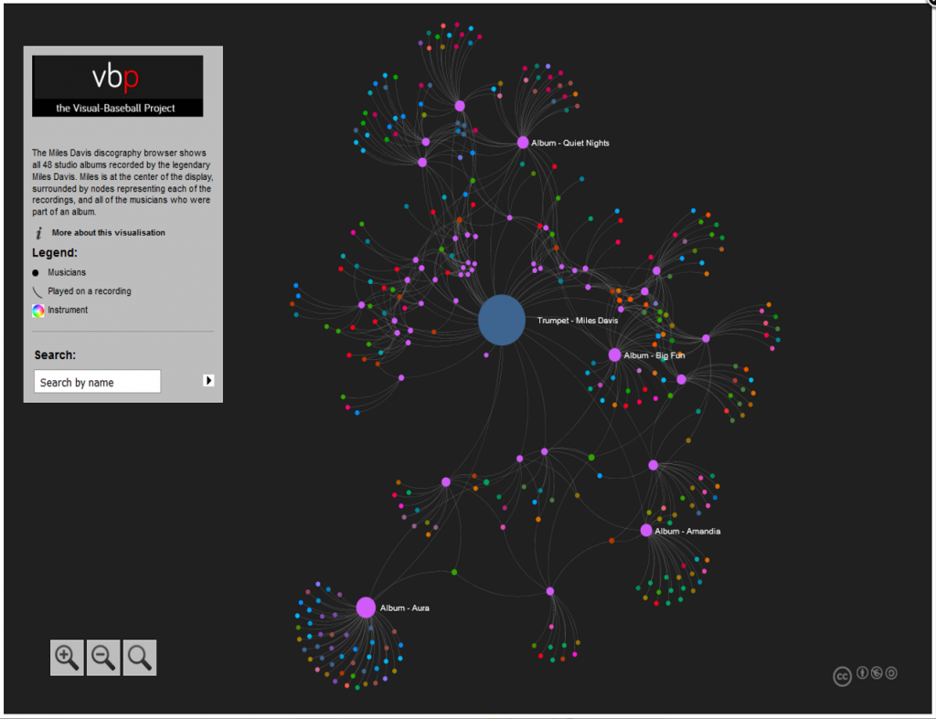
We see some interesting patterns in the graph, specifically in viewing the pink circles, which represent individual albums. Musicians playing on a recording can be seen adjacent to that recording, except in the case of musicians present on multiple albums. We would expect them to be positioned relative to all of the recordings they played on. A quick visual scan leads to five distinct clusters, as seen in the next screenshot.
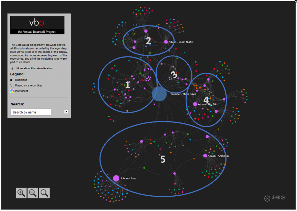
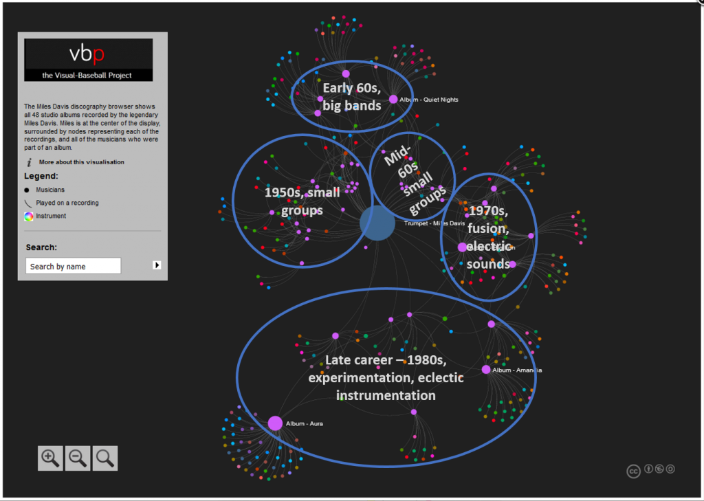
Now that we have identified these clusters, it would be helpful to understand their meaning and relevance to Miles career. Using the graph in interactive fashion, we can learn more about the recordings and musicians, and begin to formulate some insights. These can be confirmed by referring to album links on the web or in Wikipedia, which give context to what we are viewing. Based on these steps, here is a quick overview of the five clusters.
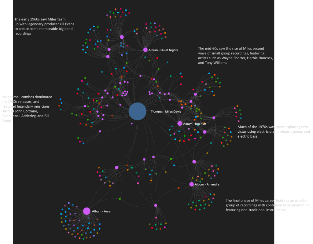
A final step might be to add some verbiage using PowerPoint or Inkscape, which I’ve done below in very minimalist fashion. We could also add this to a web version using CSS attributes to position the text, although this could get tricky as we pan and zoom on the graph. We might be better off using some sort of stylized marker (color or shape) to communicate some of this information.
There is much more that could be done, but I hope this brief example shed some light on the usefulness of network graphs, especially from a pure visual perspective.
